Redesign: Canada Post Ship-In-A-Click

Preliminary research
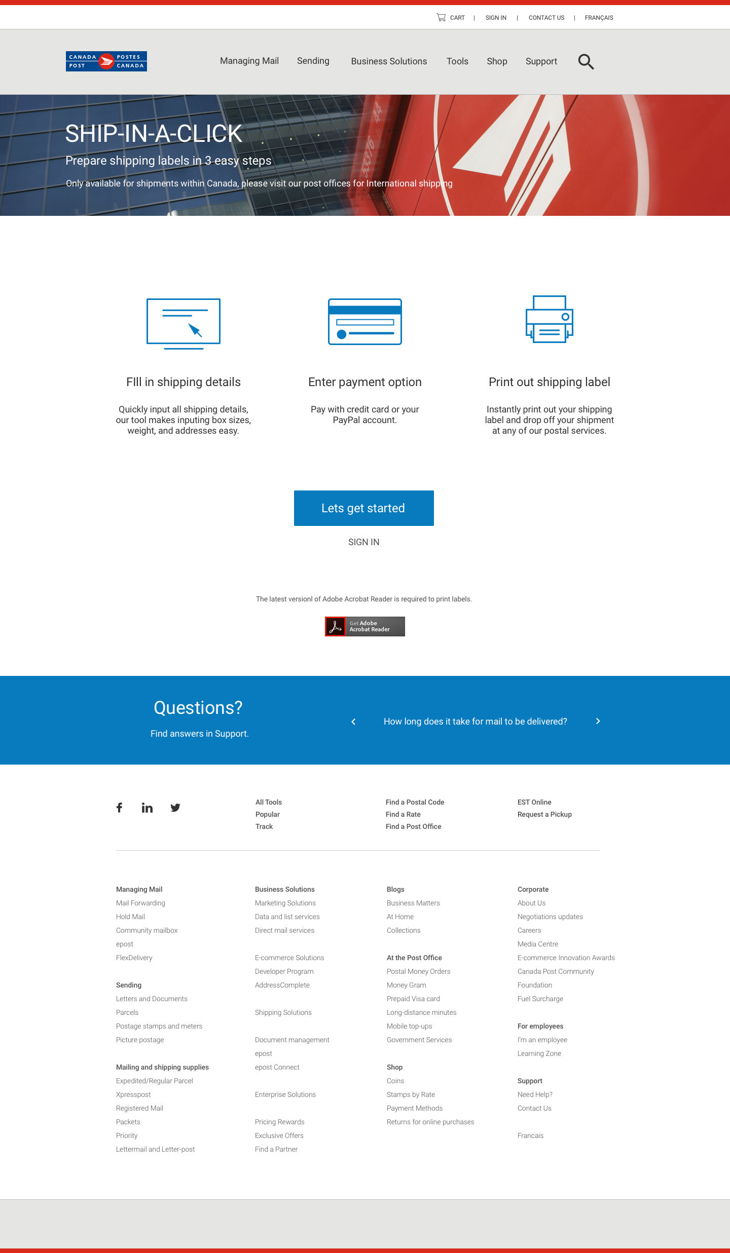
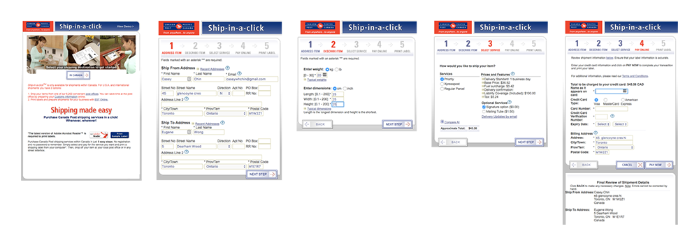
Research was done by going through the current Ship-In-A-Click process, getting insight on the current users, and analyzing their competitors. From gathering this information, a list of pain points were identified to be used in improving the experience and design. The current design can be seen below.
Pain Points:
- 5 step process is dreadful
- Poor organization of steps and user flow
- Design needs to be up to date with current trends and branding
- Information is not clear, many fields not needed, copy is confusing
Redesign
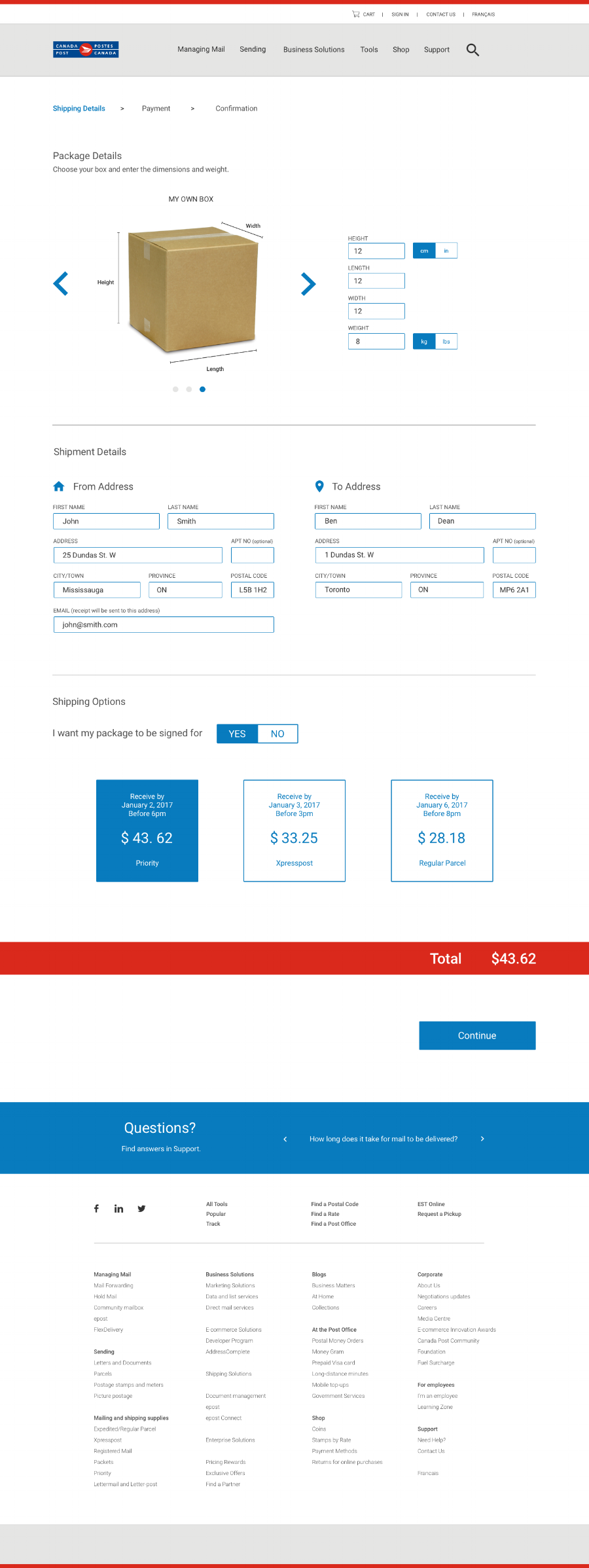
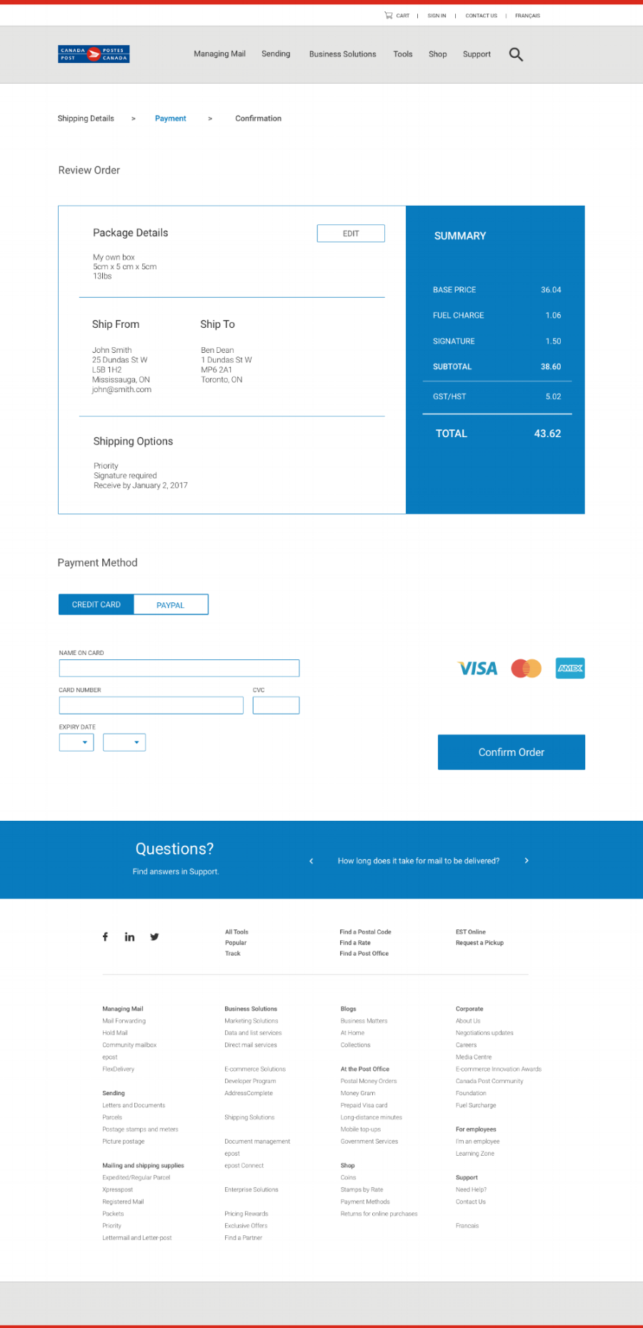
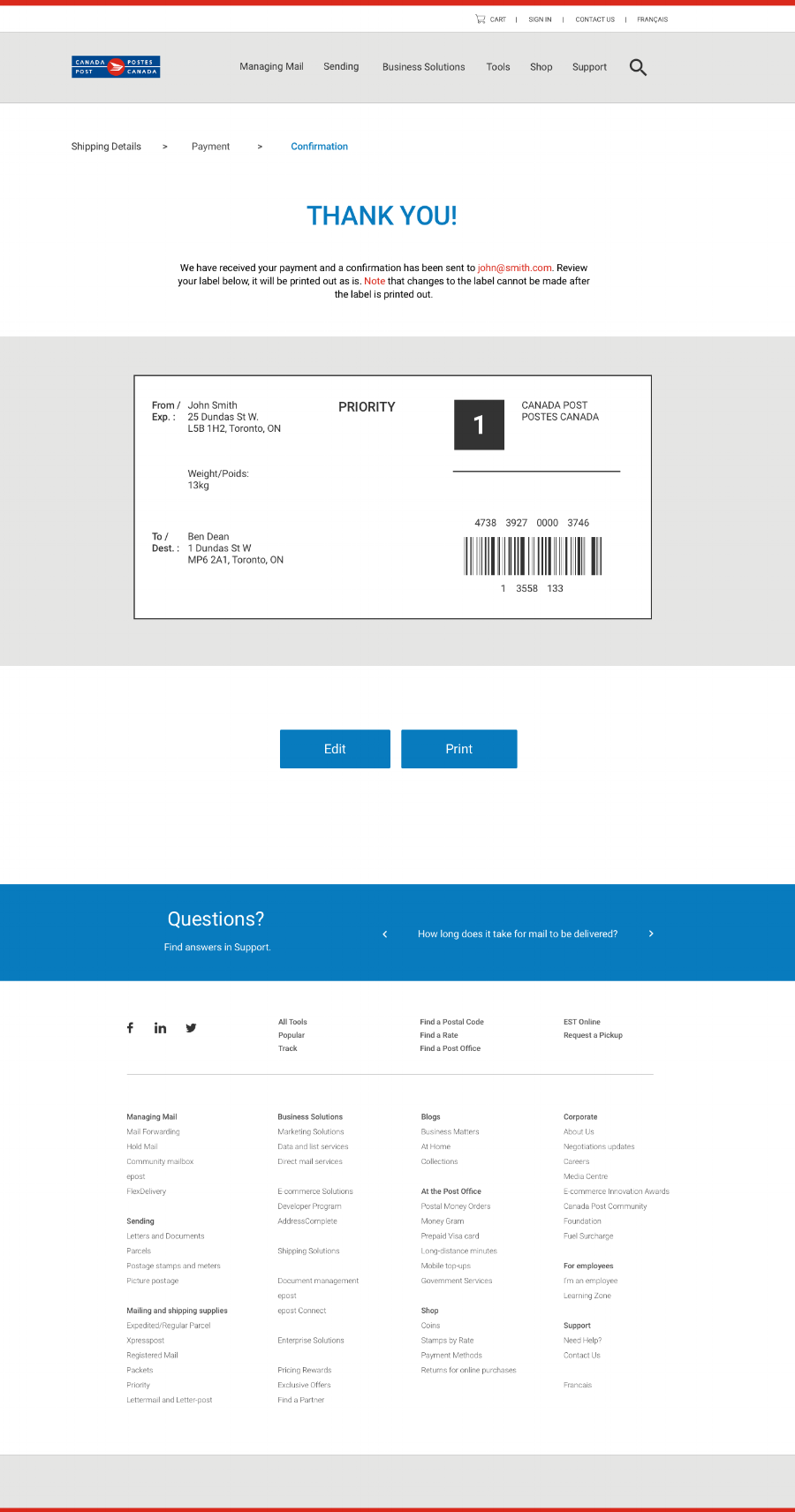
For this redesign, I wanted a clean interface with the current steps simplified into an easy flow. The design incorporates the same colours, typography, and visual experience from the brand identity of Canada Post.
Redesign Opportunities:
- Cleaning up the 5 steps into a 3 step process
- Updating visual elements that speak with the current brand and time
- Layout of information hierarchy to be less complicated
- Create a user friendly experience that upholds the name of the product 'Ship-In-A-Click'
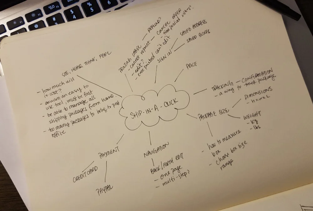
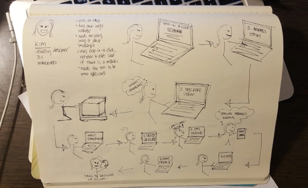
Process Work
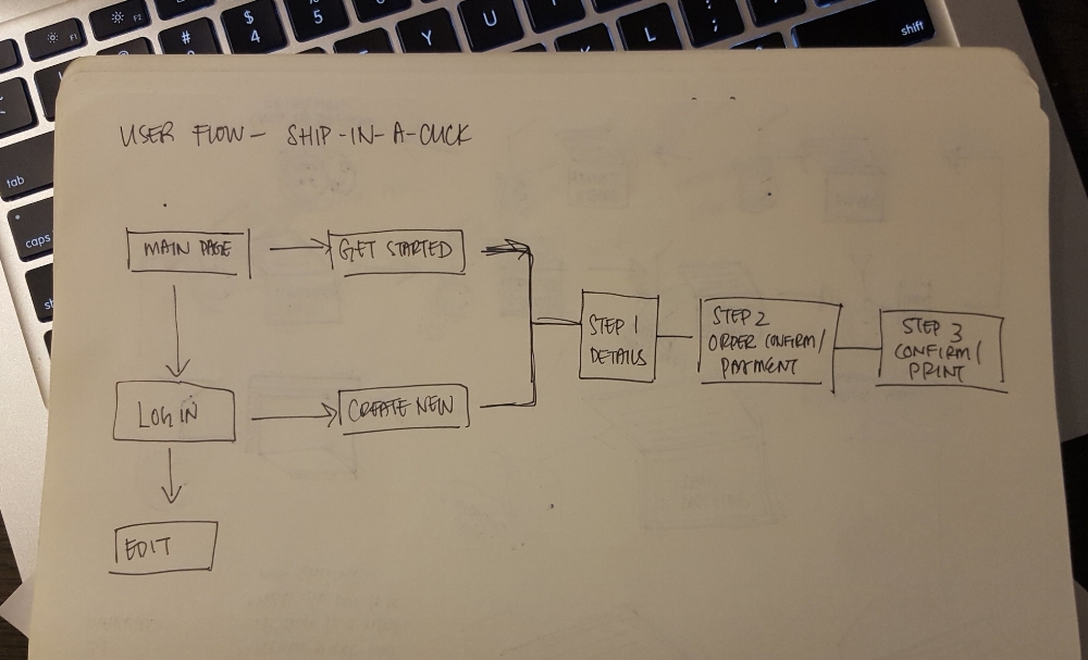
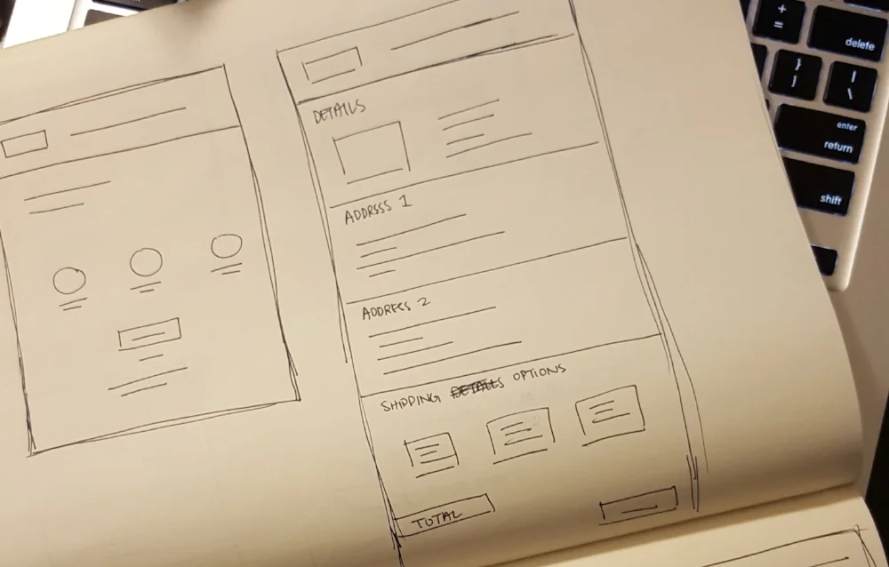
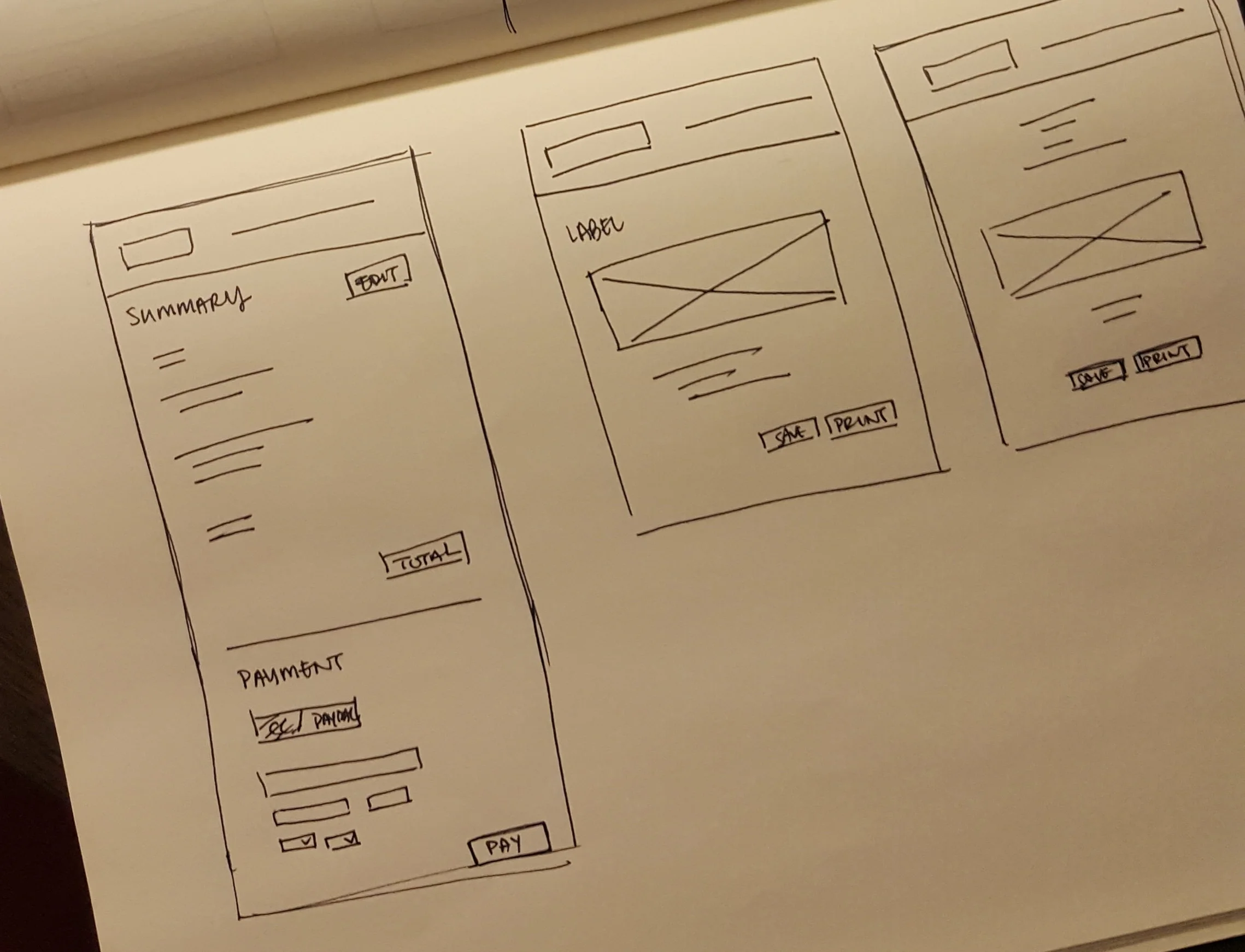
Wireframes
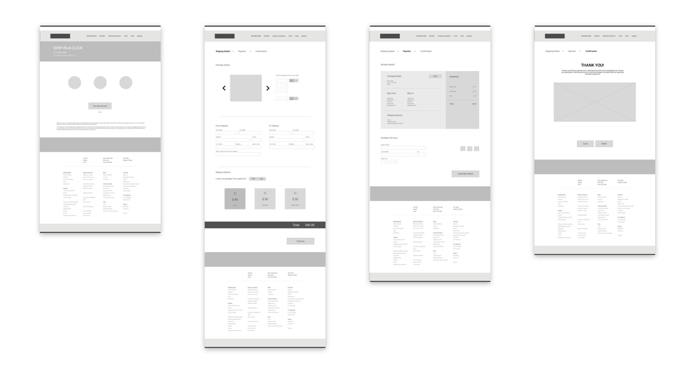
High Fidelity Designs