Mobile Design: Quote
USABILITY + App Design + branding
This project is the outcome of a ten-week immersive bootcamp on User Experience and User Interface Design at BrainStation. The concept of Quote App is to reinvent the renovation process through efficiency and communication by connecting homeowners and contractors. The user is able to create a project to get an instant estimate, find a contractor, and manage their project all on one platform.
The Creative Process
Research | Journey Mapping | Sketching | Wireframes | Usability Testing
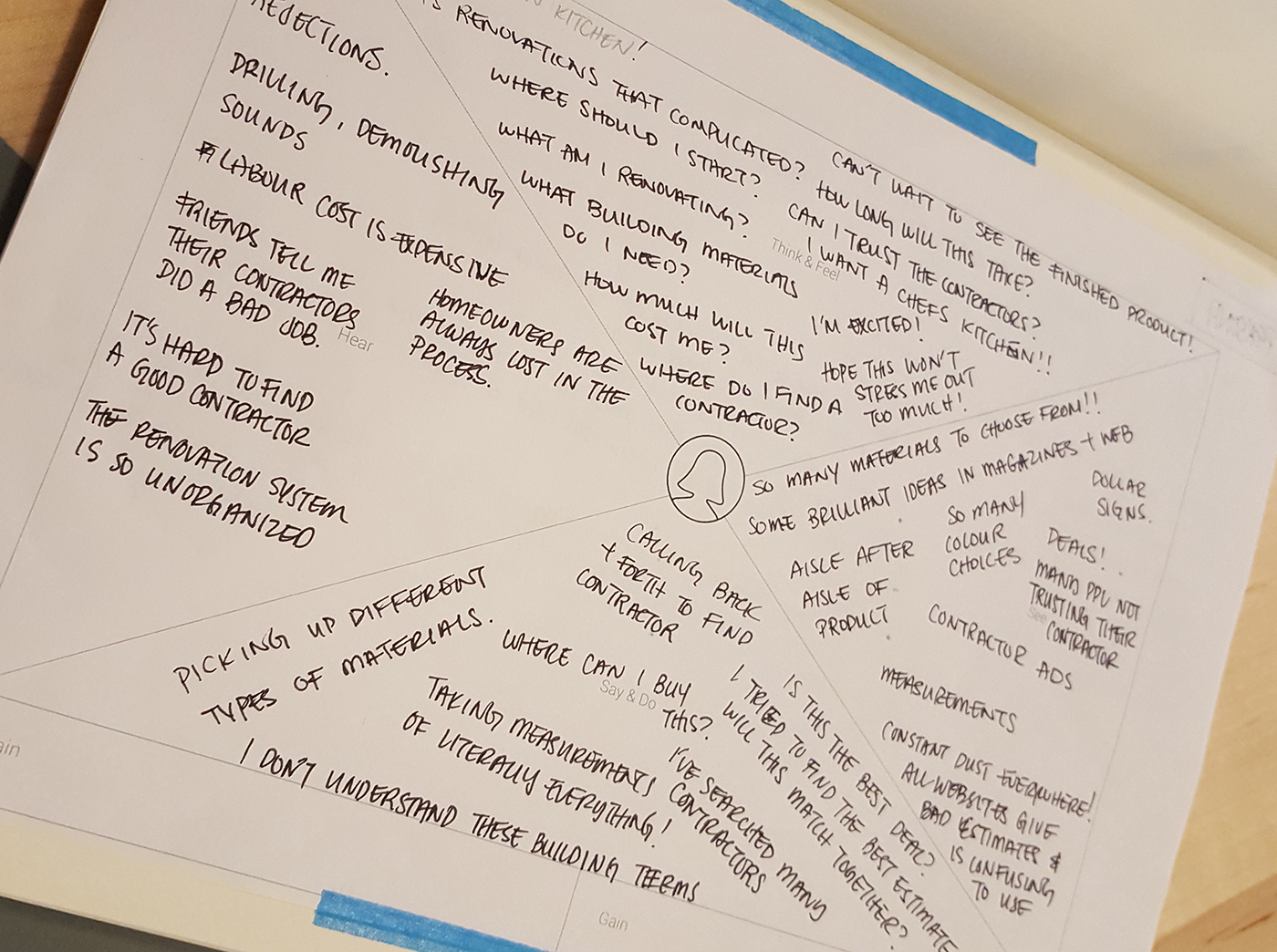
Empathy Mapping
The process began with listing out assumptions and being able to empathize with the target audience. From a list of assumptions, interview questions were compiled and an empathy map was created which noted down what users would hear, think/feel, say/do, and see.
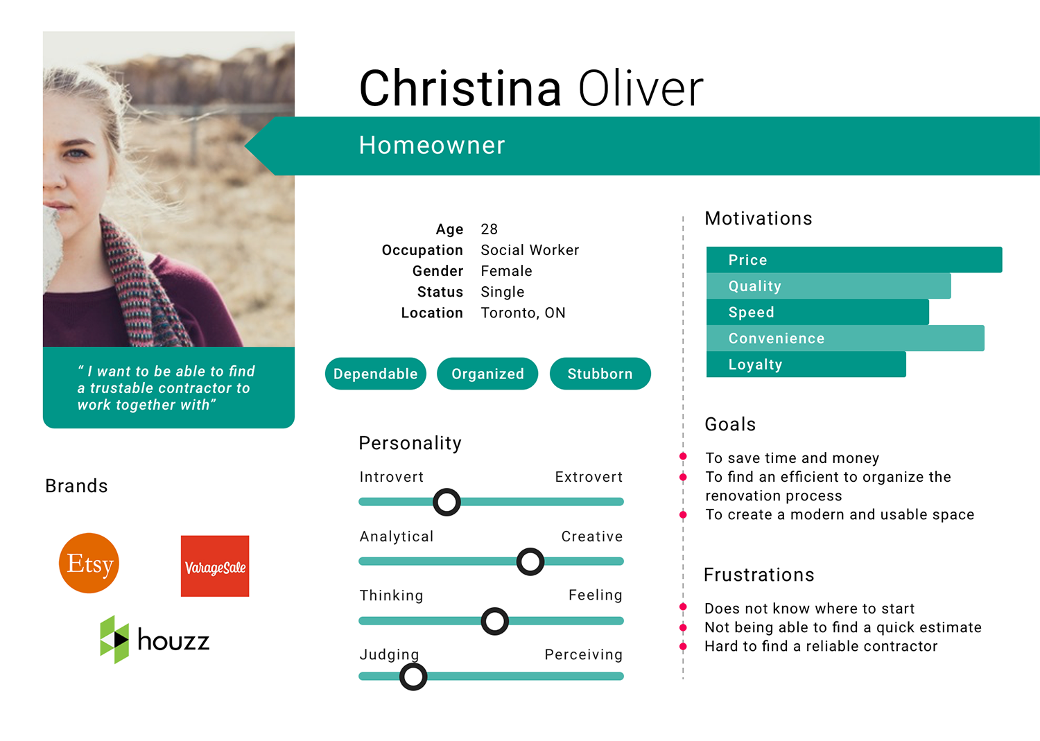
User Persona
Creating a persona helped to give a better representation of the user. From doing interviews and empathy mapping, a target user was determined. Christina Oliver is recently a new homeowner and has a need to renovate a few areas in the home. She needs an efficient way to help organize that renovation process that is cost efficient as well. She is frustrated as does not know where to begin to find a quick estimate and a reliable contractor. She is always looking for new apps on renovating and design.
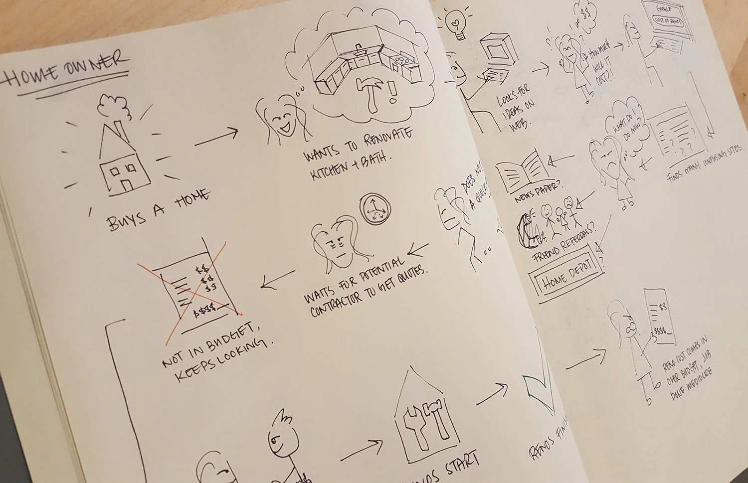
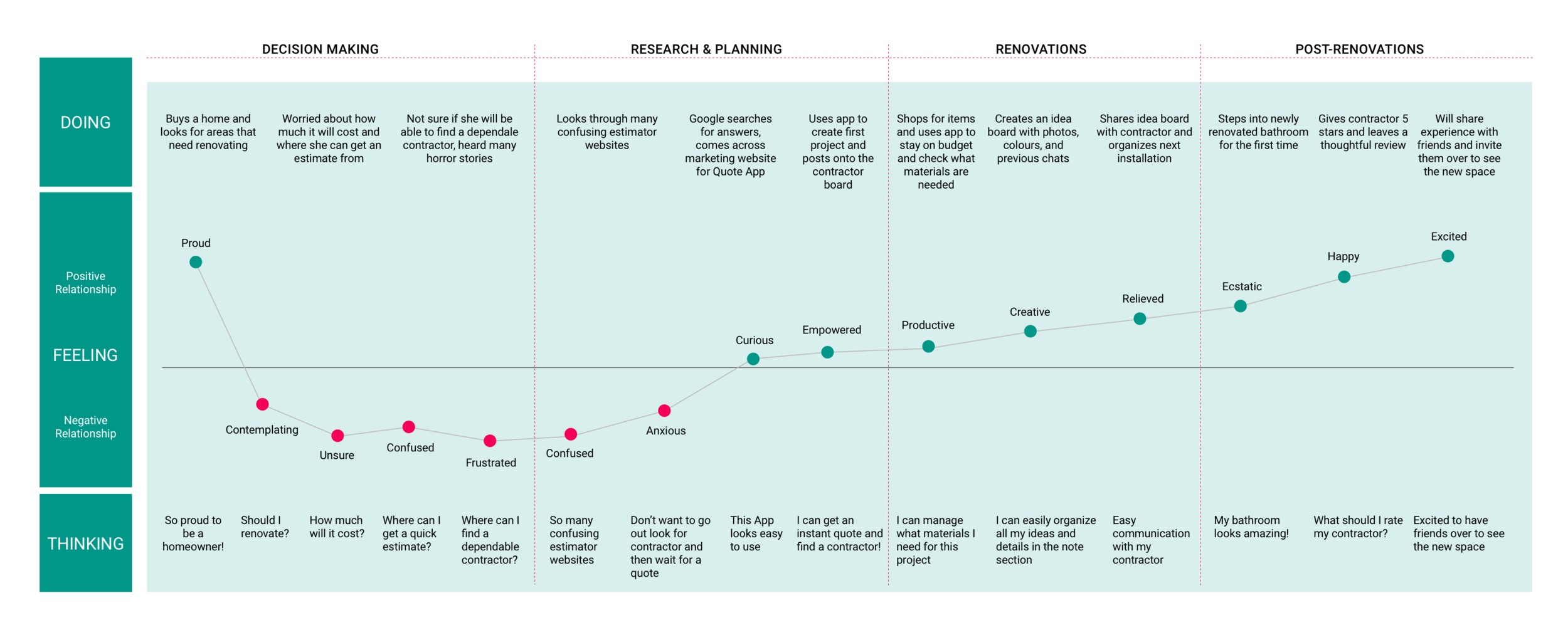
Journey Map
After creating the user persona, a journey map was created to show the process of the user from buying a home and going through the high and low points of renovating. A hypothesis was then made.
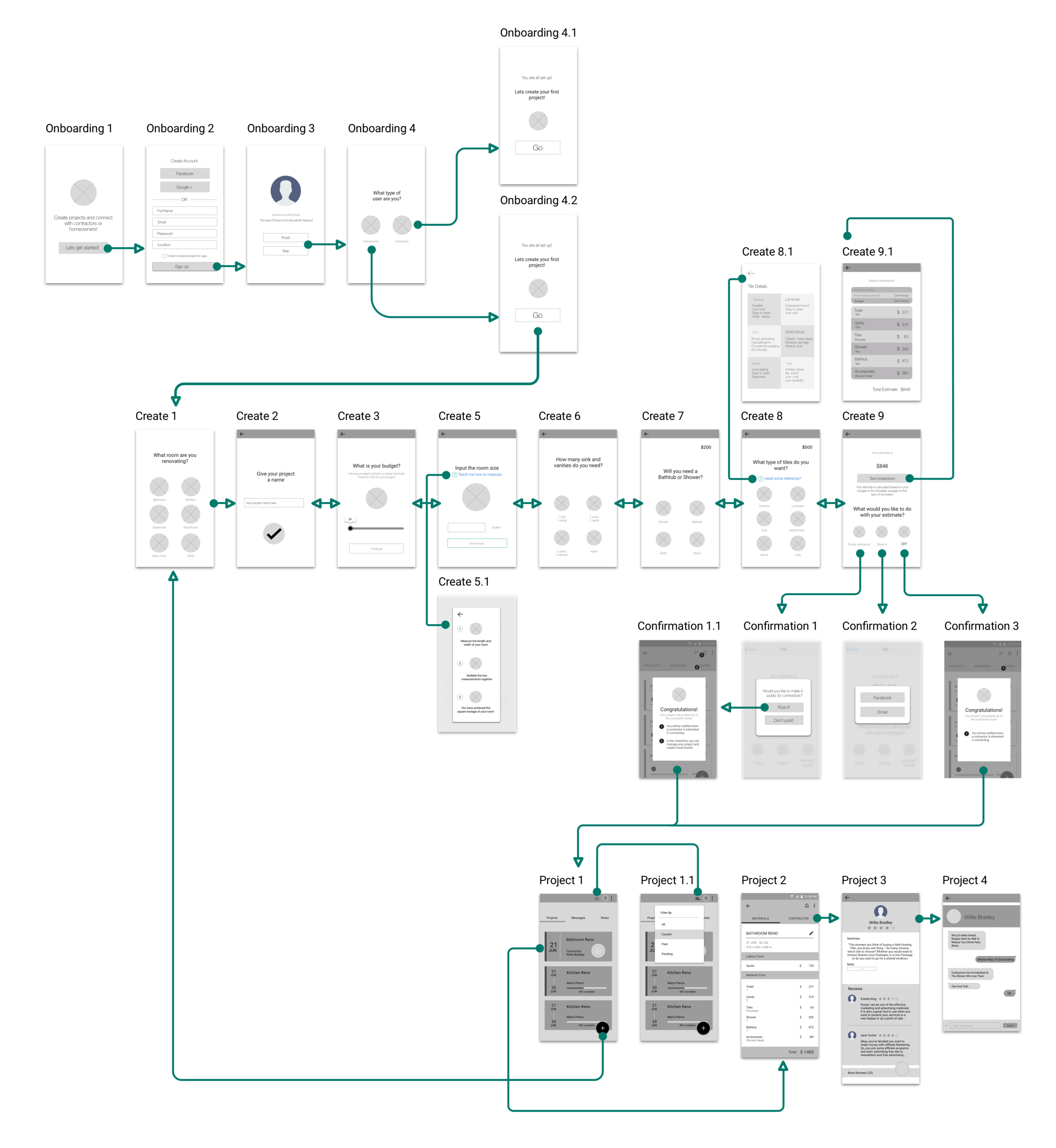
User Flow
Following sessions of user research and market research, a user flow was created to help better visualize the flow of a typical user and what screens would be needed. This flow shows how a user would sign up, create a project, and manage their project.
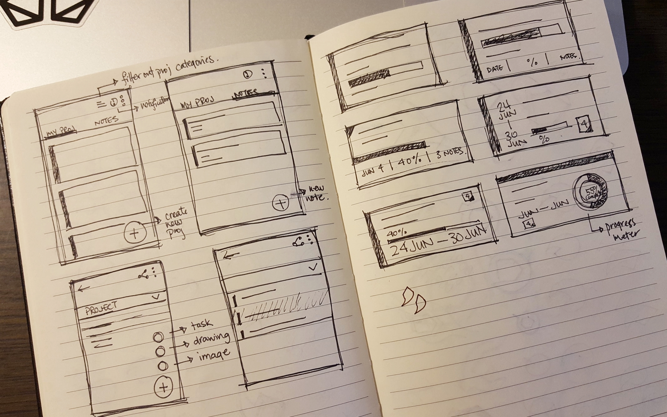
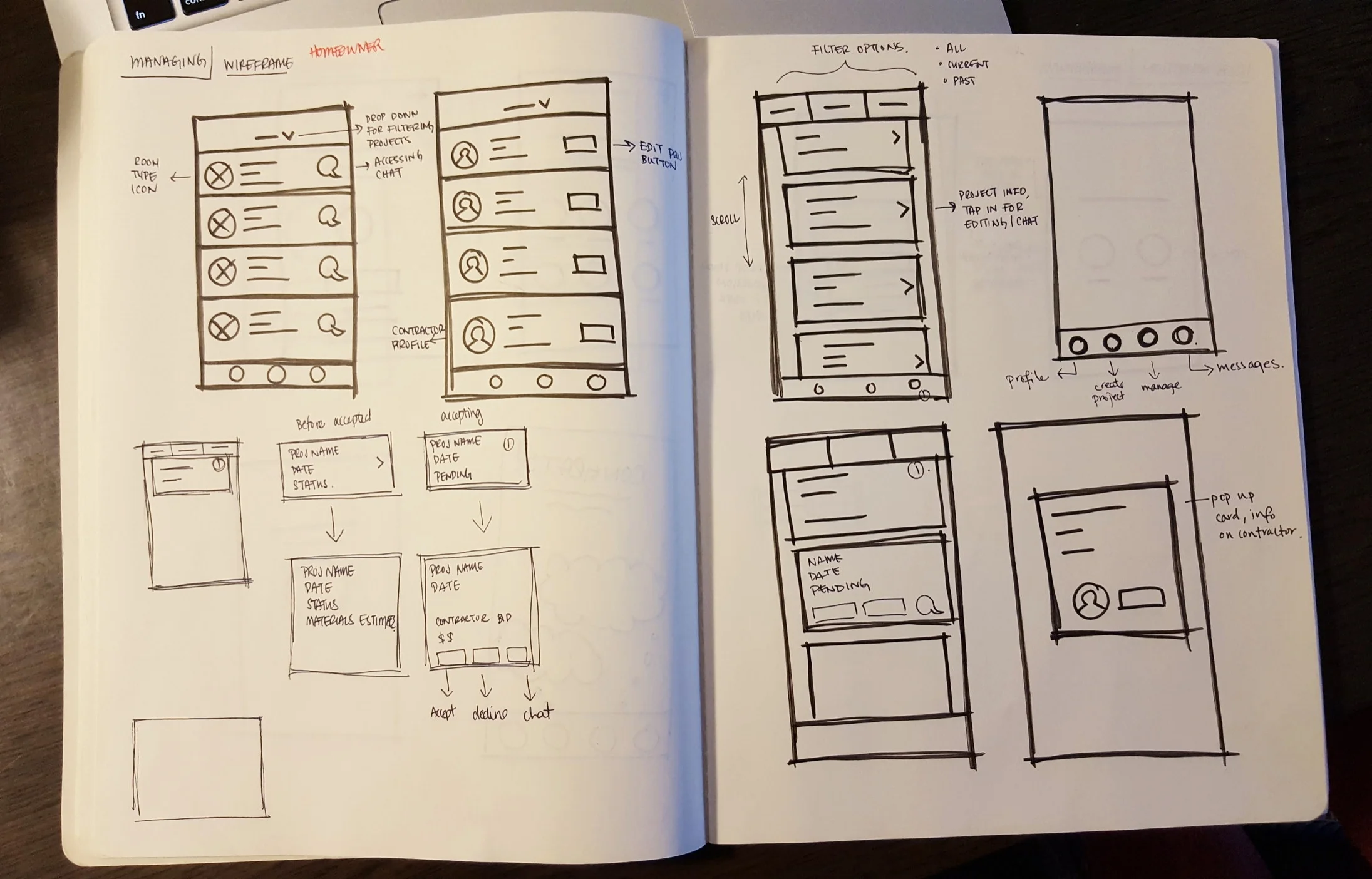
Sketching
Preliminary wireframe sketches is a creative approach to exploring possible solutions quickly, and a way to jot down as many ideas possible.
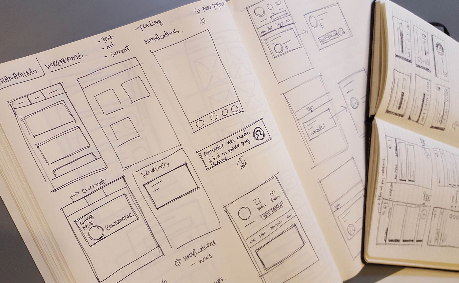
Digital Wireframe
Moving to digital wireframes was the next step after deciding that a viable flow and design was created during the sketching phase.
User Testing
An extremely important step is to conduct user testings, what works and what does not make sense will be pointed out by the users. Prototypes were created through InVision for a way to easily show users the flow of the App. Each user testing was documented into a session output to collect feedback notes from the user.
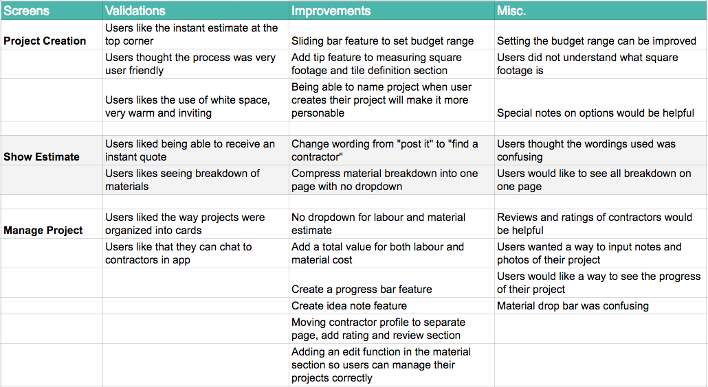
Iterations, Iterations..
After conducting user testing, there was a never ending process of iterations. The design and process can continuously change, and there is always a solution that can be better than the last. Based on the user testings and validations made, many iterations of wireframes were created with features that were added and taken away before creating hi-fidelity wireframes.
Designing the Experience
Experience Mapping
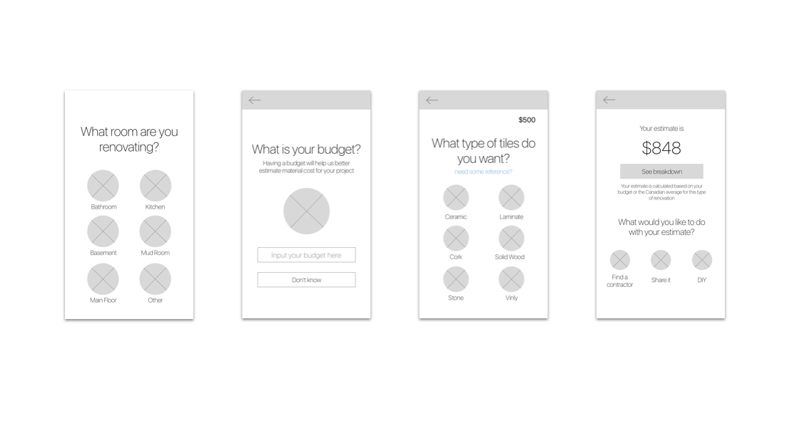
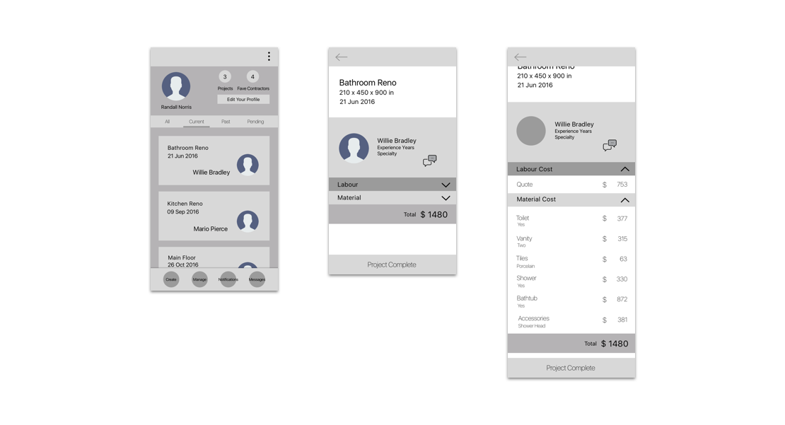
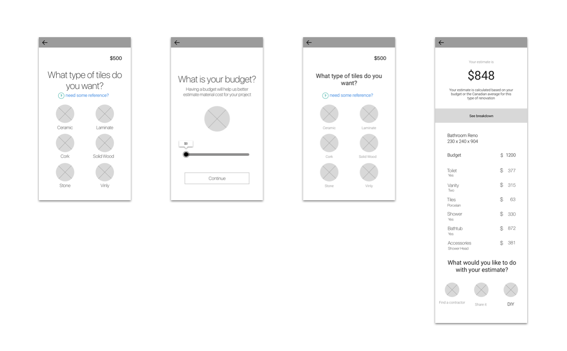
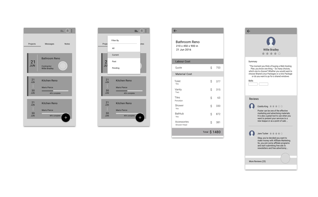
Hi-FIDELITY MOCKUPS
Through many sessions of user research, it was verified that homeowners have had extremely poor experiences with finding a reliable contractor that does good work. There was a lot of confusion with the many different types of materials on the market.
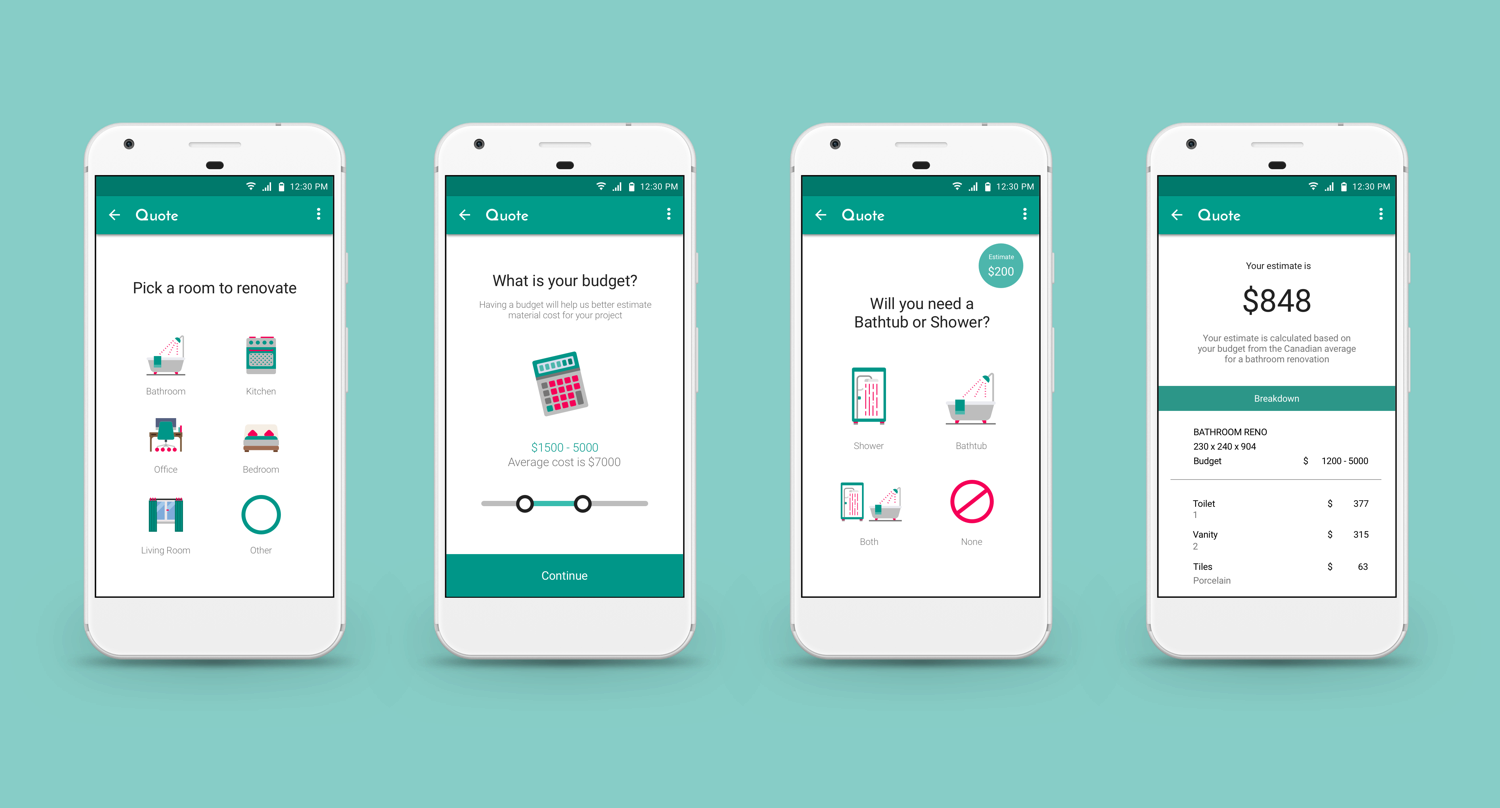
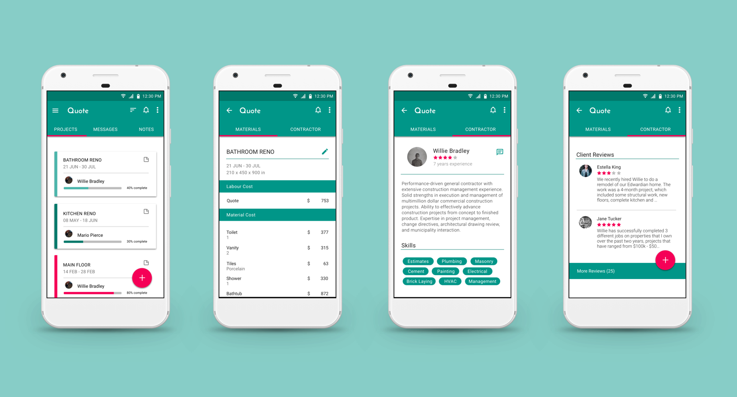
Keeping the intended user in mind, elements and design features were created to specifically target this audience. The goal to simplify the renovation process was to create a seamless “step-by-step” approach from creating a project to receiving an estimate. “Posting” their estimate on a job board allows for matching of a suitable contractor. Both parties are able to manage and share their projects by creating “idea notes” containing photos, links, colour choices, and chat logs. This feature helps to minimize miscommunication and to better understand design choices.
To aesthetically create a design with a clean and simple focus in mind, the process took many iterations through sketching, wire framing, and user testing before being able to develop high fidelity prototypes. As this App will be used during a stressful period, the design consideration was to use an uncomplicated task oriented approach to prevent anger and confusion.
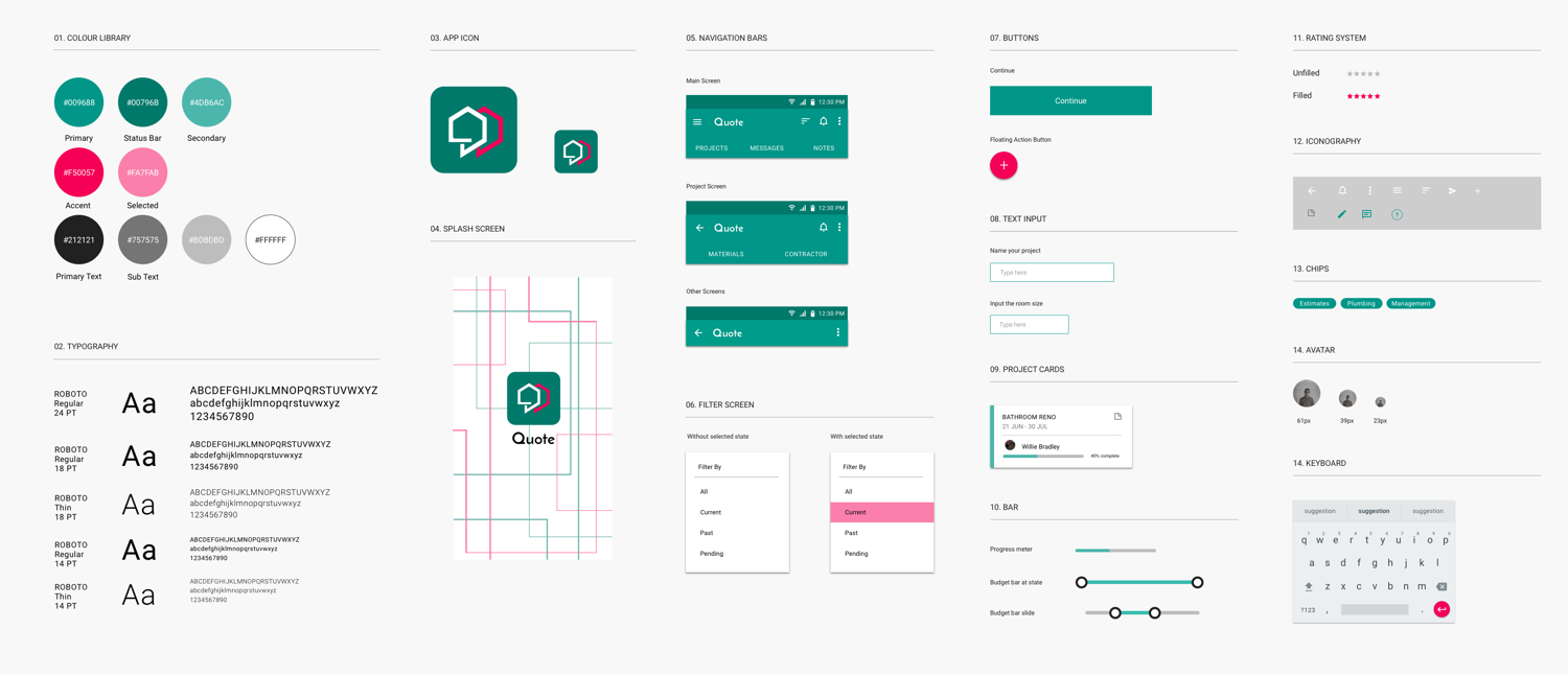
Branding
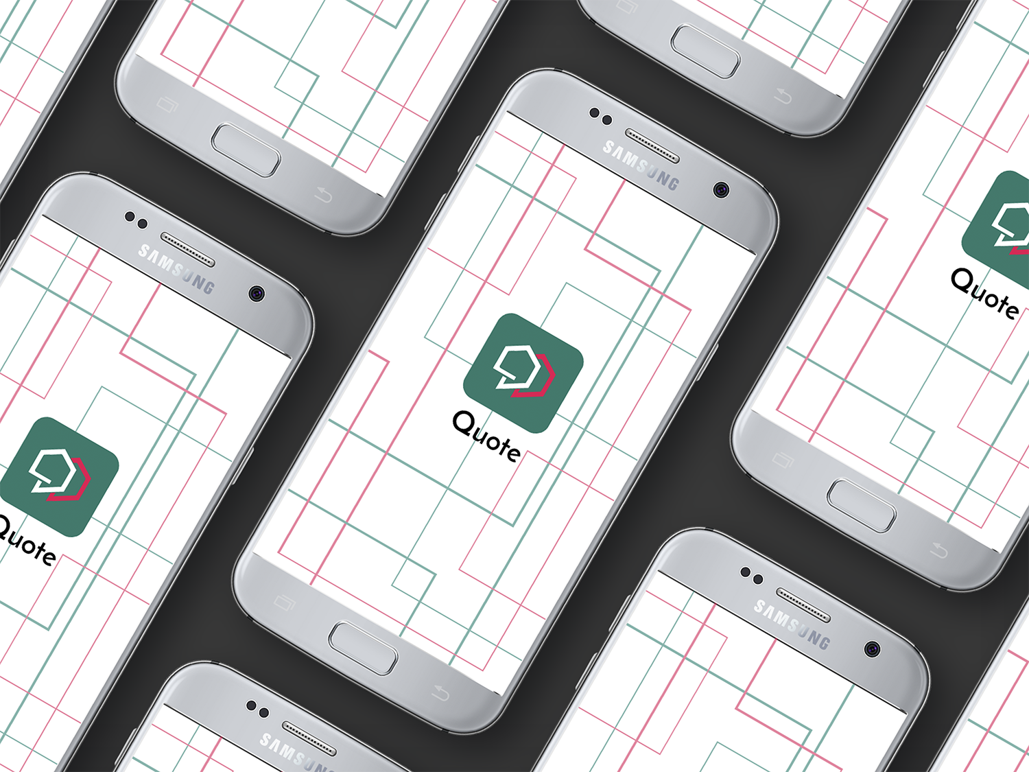
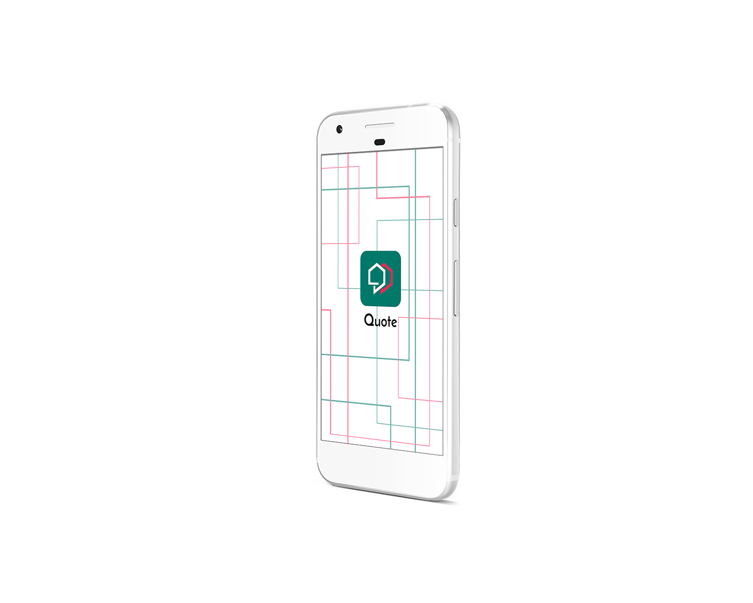
LOGO DESIGN | Sketching
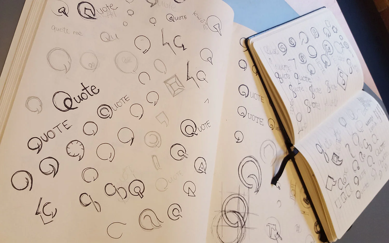
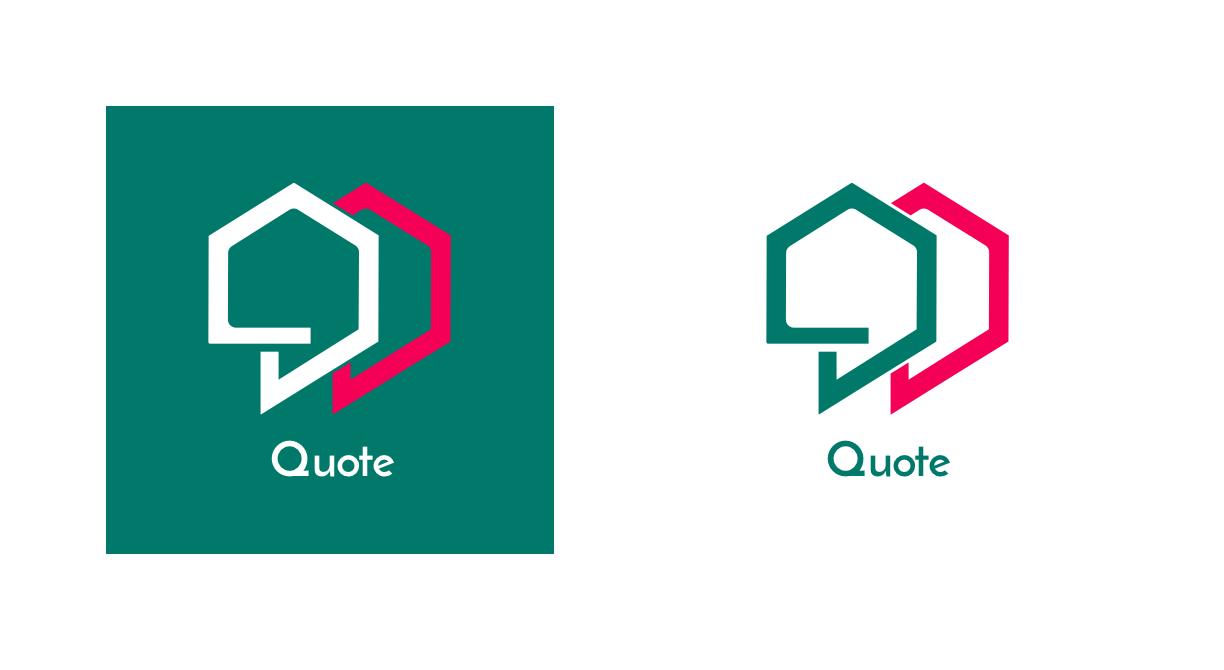
The design inspiration for the logo was taken from an attempt to visually capture both personas of the homeowner and contractor. Through many iterations of the process, elements from a bolt was applied and transformed to incorporate a house in the negative space of the quote. The two symbols of the quote in contrasting colours represent the two personas of the product.
Colours chosen for this product was deeply influenced by the target audience and the concept of the application. A turquoise green helps with clear thinking and decision-making that assists with organization and management skills. Green by itself is the colour for growth and renewal portraying certain aspects of the product. As the renovation process can be extremely stressful, the accent colour pink helps to calm and reassure the mind.
From an attempt to design for androids, strict guidelines for material design were taken into consideration when designing all elements of this application.