
Global Navigation Redesign
Designing an easy ecosystem for users to find and discover products.
Easy navigation is key to a user’s shopping experience.
When you walk into a massive retail store, you expect clear aisle signs, an obvious layout, and a quick way to find what you came for. Online, the global navigation is that storefront. It’s the digital front door. Once a customer opens it, there are a ton of different paths they might take to get to a product. Some go straight to the search bar, others browse by department, and some click on promos. Our job is to make sure every single one of those paths feels smooth and effortless.
But over the years of rapid growth, Home Depot Canada’s navigation started falling behind. Our product catalog had expanded, new categories were constantly being added, and the way people shop had completely changed. The old navigation was creating a lot of friction for our customers and no longer supporting the business the way it needed to.
We needed to step back and look at the whole ecosystem from top to bottom. This meant a complete overhaul to rebuild the global header, “Shop by Department” menus, the “My Account” hub, and the footer. The goal was to clean up the clutter and create a modern, accessible, and scalable design that actually helped our customers shop with ease while driving business growth. We wanted to make sure that the moment a customer walked through our digital front door, they knew exactly which aisle to turn down.
Project Role & Overview
Role: UX/UI Designer
Timeline: 3 months
Cross-functional partners: Product, Engineering, DevOps, SEO, Marketing, Research
Business Goal: Drive conversion through fulfillment transparency
Project Scope
Global header & footer
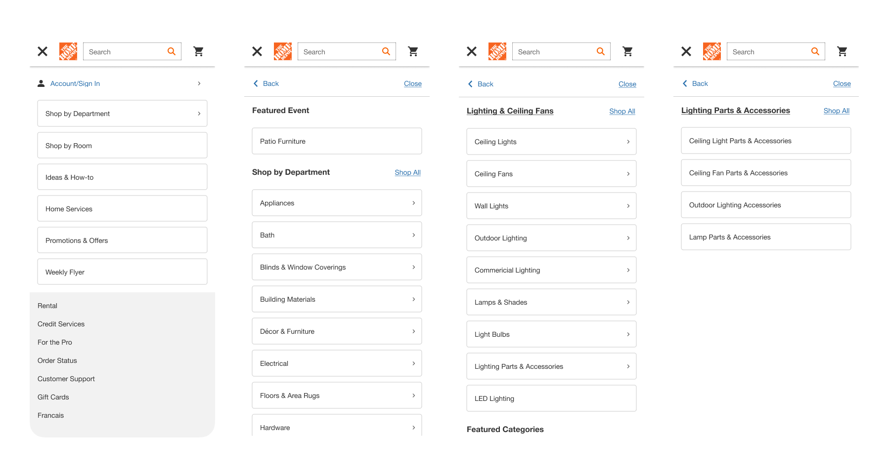
Shop by Department
Search bar and interaction redesign
My Account sign-in and navigation
Desktop, tablet, and mobile web experiences
The Challenge: Dissecting a Broken System
To build a better solution, we first had to completely dissect what we already had. We mapped out the entire anatomy of the current header and footer across desktop and mobile, examining every single link, dropdown, and component. We also had to look closely at the ad placements tucked inside the navigation; while they weren't necessarily confusing to users, that real estate belonged to our marketing team, meaning any structural changes would require close cross-functional alignment.
“When I was trying to shop by department, the page would not stay open to allow me to click on the area I was searching for. Very frustrating!”
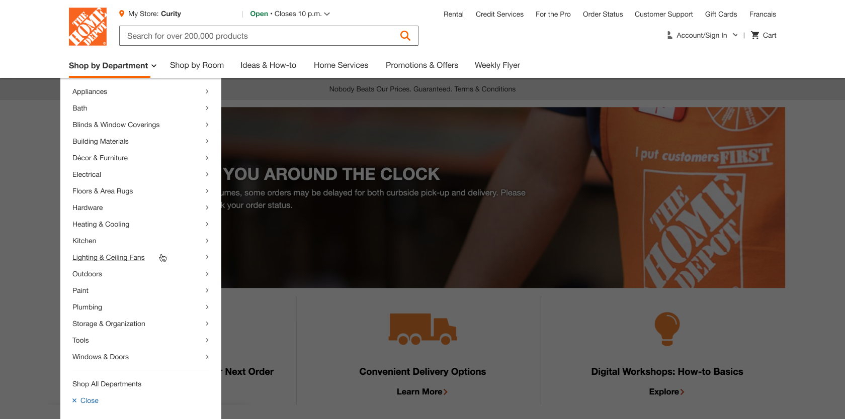
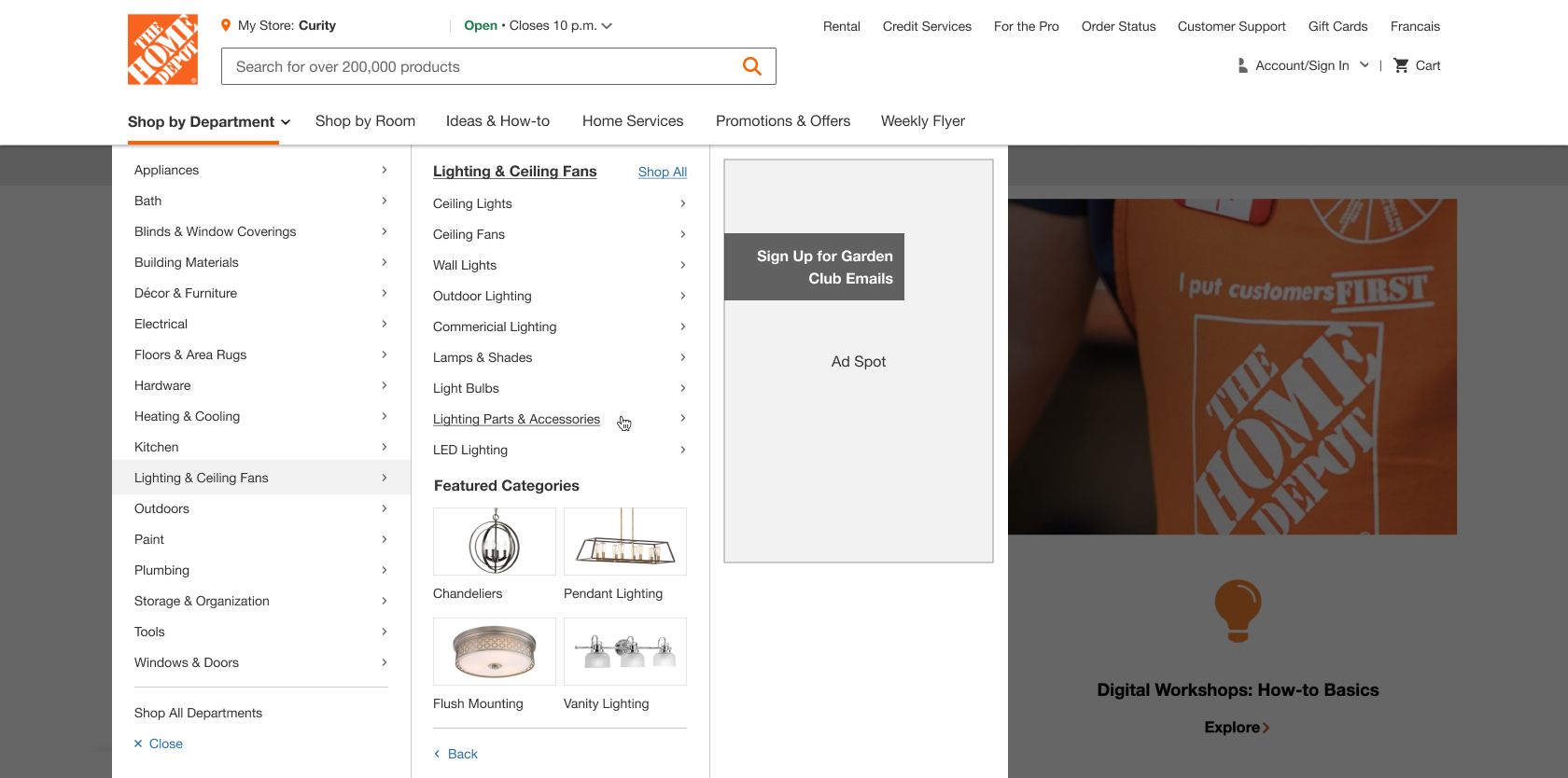
Key Desktop Challenges
On desktop, our biggest hurdle was inside the "Shop by Department" menu. The visual hierarchy between main departments and deep sub-categories was completely blurred, making it nearly impossible for customers to quickly scan.
Worse, the interaction mechanics were actively fighting the user. The menu had a notorious "flickering" bug on mouse hover. If a user's hand shook even a fraction of an inch, the entire menu would vanish, forcing them to start their hunt all over again. To round out the desktop issues, the global footer was a disorganized mess of mismatched data groupings, and the whole page was filled with major accessibility red flags.
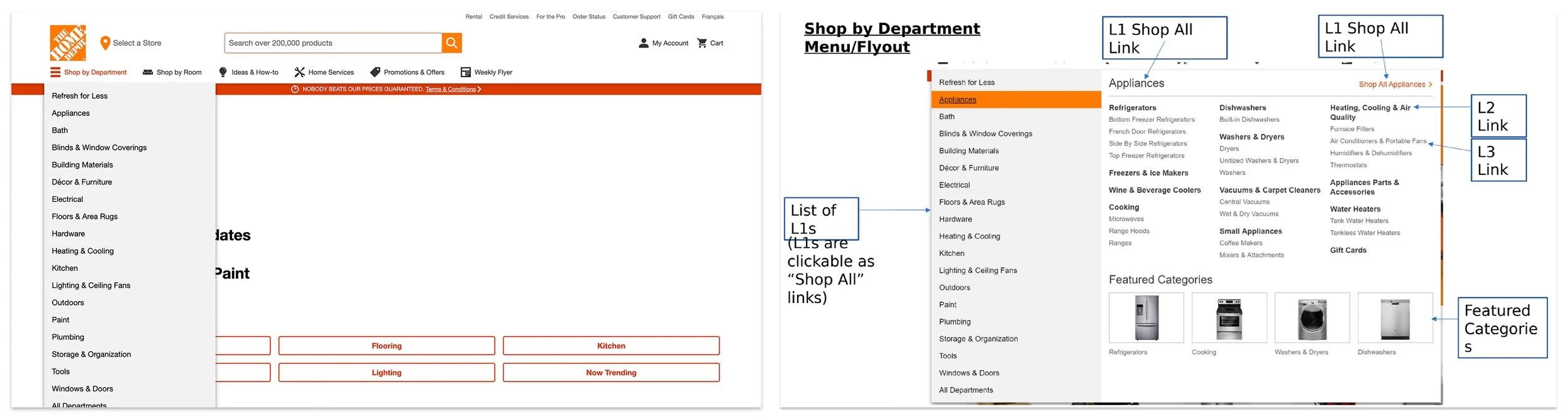
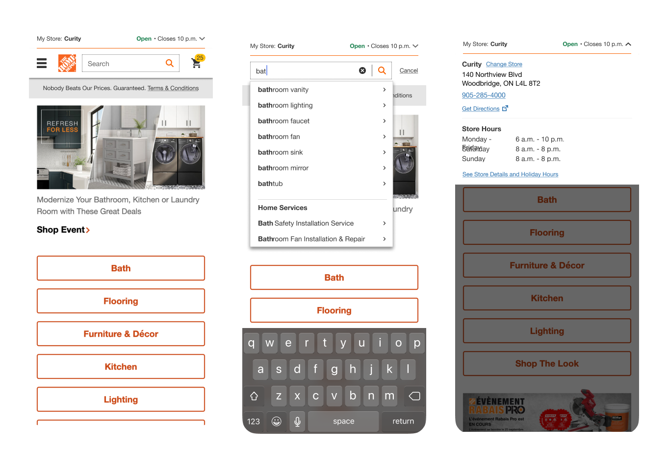
Desktop Header and Shop by Department (SBD) before redesign
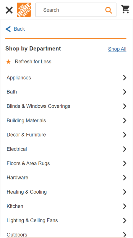
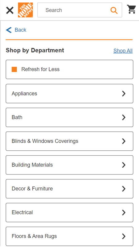
Key Mobile Challenges
When we looked at mobile, it didn't even feel like we were on the same website. The styling used completely different colors, and the component logic was disconnected from the desktop experience.
Because screen space is at a premium on mobile, the old layered layout quickly caused massive cognitive overload. The UI overused icons by trying to shove a visual graphic next to every single category. Navigating down to the next product tier was completely unintuitive because the design system was being misused; buttons, chevrons, and accordions were tossed together randomly, leaving users guessing what would happen when they tapped. On top of that, we were failing hard on foundational accessibility; tap targets were too small for a thumb, color contrast was poor, and the mobile footer left users totally stranded.
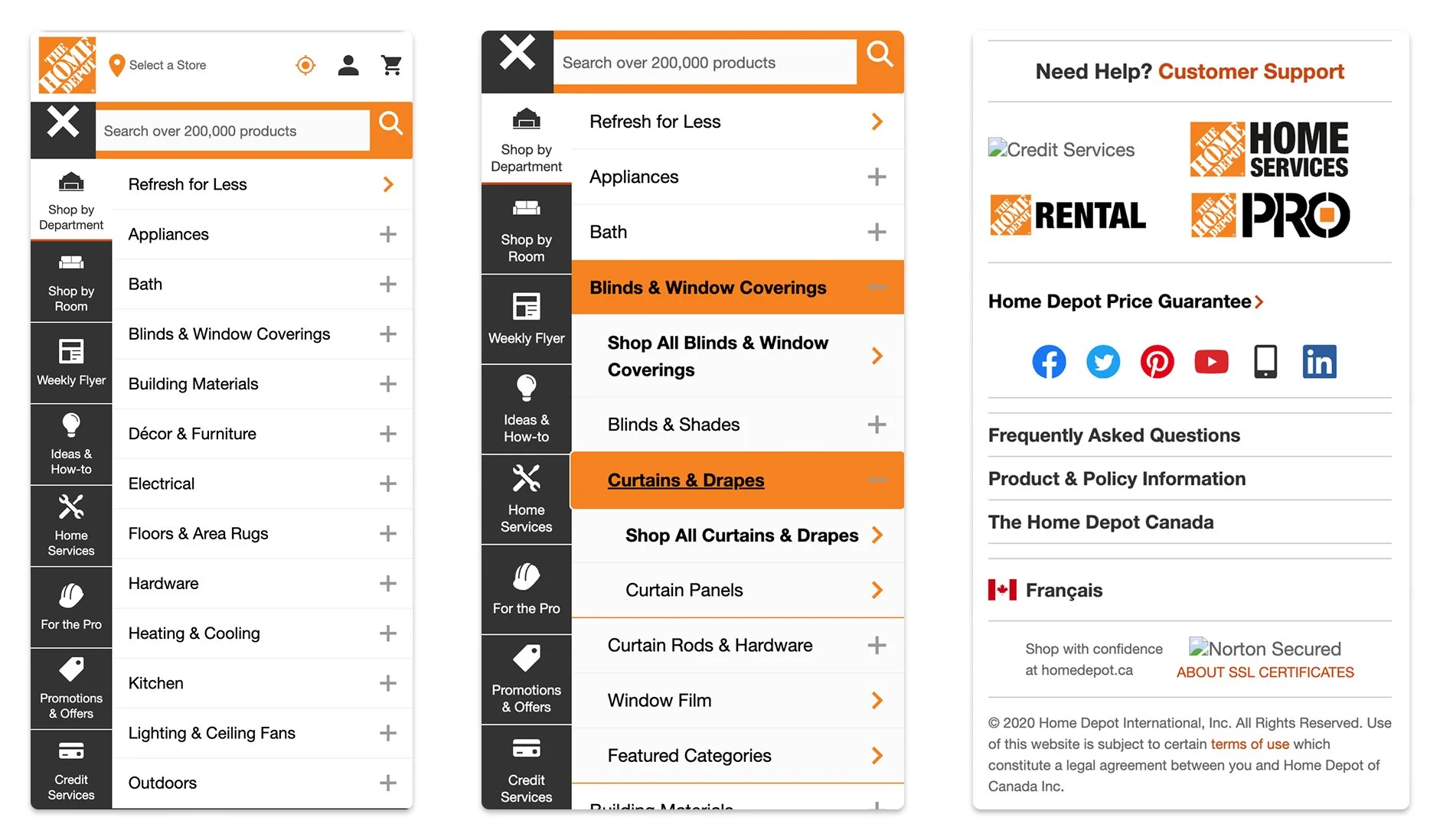
Mobile Header/Shop by Department (SBD), and Footer before redesign
Defining Success: What We Were Aiming For
When you're tackling a piece of real estate this big, you have to satisfy two different audiences: the business trying to hit its numbers, and the customer just trying to buy a hammer. Before we sketched anything, we sat down to define what a "win" would actually look like for both sides.
For the Business
We wanted to make sure our changes were actually moving the needle. We focused on three main goals:
Getting people into the menus: We wanted to see more customers successfully using the "Shop by Department" menu to find what they needed, which would naturally help drive up sales.
Helping people discover more: We needed to make it easier for shoppers to stumble upon categories they might not have known we carried.
Making it accessible for everyone: The new design had to fully meet AA AODA accessibility standards. This wasn't just a legal requirement for us in Canada; it was about making sure the site genuinely worked for everyone.
For the Customer
For our shoppers, success meant taking the frustration out of the old experience and making everything feel smooth. We focused on:
Clearing out the clutter: We needed to lower the confusion, especially on mobile, by stripping away the useless icons and fixing the messy mix of buttons and accordions.
Simplifying the departments: We wanted to make moving from a main department down to a specific item feel fast, seamless, and logical.
Creating a consistent feel: Whether someone was sitting at a desktop computer or browsing on their phone, the navigation needed to use the same clean patterns so they never had to relearn how to use our site.
Design Discovery & Insight Development
Workshop & Ideation: Getting Everyone in the Room
Once we knew what we were up against, we didn’t just retreat into a design silo. We kicked off our ideation phase with collaborative workshops, bringing in cross-functional partners from across the company, including our marketing team, since we needed to align on how to handle the ad placements inside the menu real estate.
Together, we looked at how our competitors handled complex category systems, mapped out "How Might We" sessions, and did rapid sketching and voting exercises to see what ideas stuck. It was a fast, messy, and incredibly helpful way to get everyone aligned on the same page.
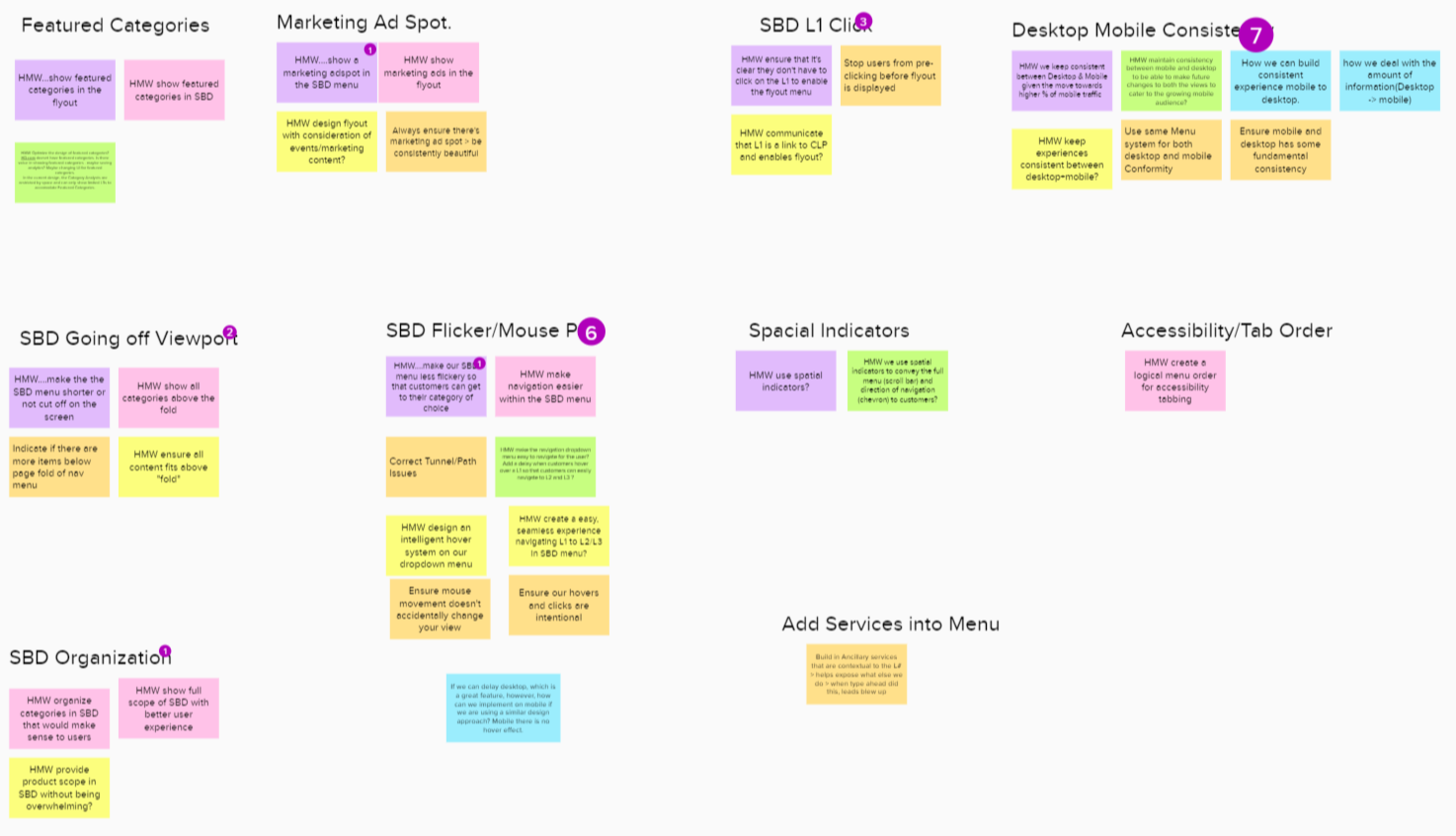
How Might We Notes
Sketching
Wireframes & Iterations: Testing Our Assumptions
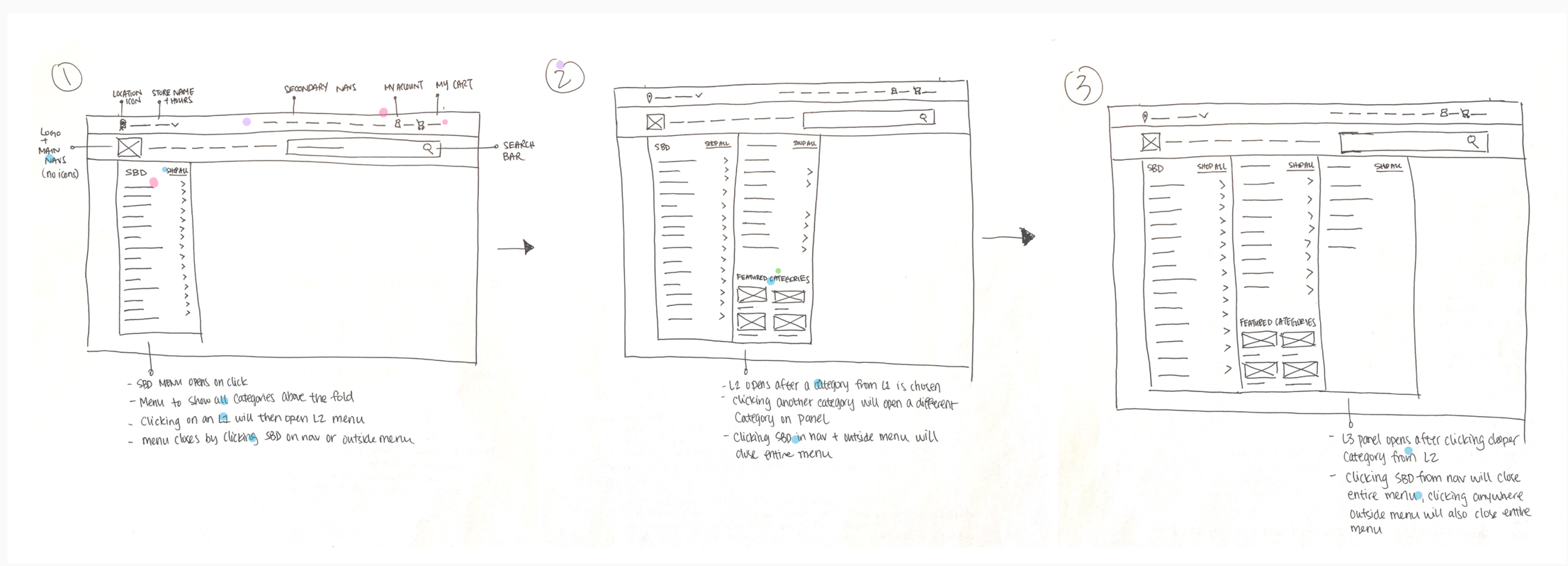
With a clear direction from the workshops, I took those rough concepts and started translating them into user flows and low-fidelity wireframes to map out the new journey.
But when you're dealing with an enterprise catalog as massive as ours, moving things around on a screen quickly brings up a lot of tough questions. For example, we debated whether users on desktop would prefer a mega-menu that showed all three category tiers at once, or if that would completely overwhelm them. On mobile, we were moving away from the old messy layout to a pattern where tapping a chevron slides open a full side panel, allowing users to dive deeper into L1, L2, and L3 categories and navigate back and forth smoothly. We needed to know if this shifting panel pattern would feel natural or if users would get lost in the tiers. Instead of designing based on guesswork, we turned these open questions into the exact scenarios we needed to test with real users next.
User Testing: Assumptions vs. Reality
We ran two rounds of moderated user testing to put our mobile and desktop prototypes to the test. Right away, our users gave us some incredible reality checks that completely reshaped the final product.
Round 1: Rewriting Mobile Muscle Memory
We started by testing the core mobile header. We had initially placed the mobile menu hamburger icon on the right side of the screen, assuming it would be easier for right-handed thumb tapping.
The Reality Check: Users completely missed it. Years of browsing habits had trained them to look for the menu on the top left. They were stalling out trying to find the front door, so we immediately iterated and moved it back to the left.
Round 2: A/B Testing the Menus
For the second round, we focused heavily on search, the "Shop by Department" (SBD) interaction, and overall scannability. We split-tested two different UI directions:
The Winner (Version 2): This version won because we gave the category links a distinct pill-shaped container treatment. In Version 1, users only tapped the text because they weren’t sure the whole row was interactive. Version 2 made the entire row feel obviously tappable, while providing much-needed breathing room for better readability.
The Taxonomy Trap: During a task asking users to find "Moving and Shipping Boxes," we noticed they slowed down significantly. We realized we changed too many variables at once, switching from hover to click-based menus, altering text sizes, and dealing with tricky backend category names. To isolate the issue, we spun up a quick, targeted follow-up test with simplified tasks (like finding "Chandeliers") to completely validate how users read and scanned our final menu layout.
Version 1
Version 2
Turning Insights into Quick Actions
Instead of letting the data stall us, we treated these discoveries as immediate action items for the final build:
Fixing the Store Locator: A few users missed our new, cleaner store locator because it was a bit too small compared to the old, bulky design. We scaled it up slightly to ensure store hours and locations remained prominent.
Adding Visual Weight: One user noted that our main navigation links didn't look clickable. Because touchscreens don't have hover states, we gave those links a more substantial visual weight so they looked like interactive elements, not plain text.
Cleaning up "My Account": Users kept looking for "Order Status" right in the header instead of the utility links. We aligned with the Account team to house everything, including order status, under a single, unified "My Account" section.
Where We Landed: A Unified, Modern Front Door
The final design successfully brought our digital storefront up to modern standards, seamlessly balancing what our customers needed with what the business wanted. We didn't just give the site a facelift; we completely re-architected how the system functions across devices.
By completely rebuilding the entrance to our digital store, we made sure that the moment a customer walked through our front door, they knew exactly which aisle to turn down.
The Desktop Experience: Precision and Control
On desktop, we stripped away the frustration of the old layout and organized the entire header hierarchy so it’s effortless to scan.
The biggest win was eliminating the notorious flickering menu. The "Shop by Department" layout is now intentionally click-based, giving users total control over their browsing without the menu vanishing if their hand shakes. Inside the menu, we created distinct visual lanes between our L1, L2, and L3 categories, making it obvious how to drill down to a specific item without getting lost.
We also gave the search bar a massive upgrade with an intelligent, image-based typeahead feature to help users preview products instantly, and we cleaned up our store locator and user settings by bringing them under a unified "My Account" hub. Finally, we protected our marketing real estate by locking in strict aspect ratios for our featured category spots. This means ads and promotions look beautiful and scale perfectly without ever breaking the page layout.

The Mobile Experience: Clean, Responsive, and Built to Scale
On mobile, we completely solved the fragmentation problem. The new layout directly mirrors the desktop experience in terms of look and logic, but is built specifically for how people actually hold and use their phones.
We threw out the messy layered layout and the confusing mix of accordions and buttons. In its place, we introduced a smooth, tiered system where tapping a chevron slides open a dedicated side panel. This lets users dive deep into categories and navigate back and forth with the intuitive feel of a native app. To cut down on cognitive overload, we completely stripped out the cluttered category icons, which instantly freed up crucial screen space and made the text links much faster to scan.
We also built every single component from scratch to ensure tap targets are perfectly thumb-sized, color contrast is sharp, and the flow makes sense, meaning the entire experience fully passes AA AODA compliance. Best of all, this new structure is completely future-proofed; as the business grows, we can add new departments and categories smoothly without ever breaking the core design.
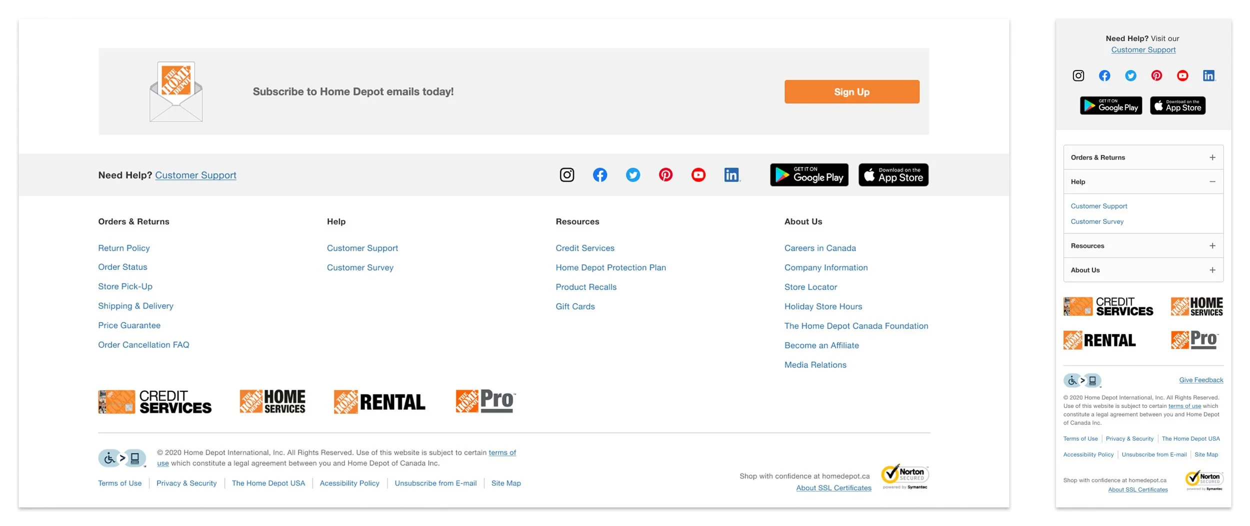
Cleaning Up the Footer
We applied that same organizational logic to the global footer, which had previously been a dumping ground for mismatched links. We threw out the messy groupings and built a clean, intuitive taxonomy that clearly separated sections like Shopping, Help, Resources, and Corporate Info. To build trust with our shoppers, we prominently featured our new accessibility badge, and we added clean app download shortcuts to give modern users an easy path to our mobile ecosystem.
Key Takeaways: Validating the Blueprint
Once the new header and footer went live, it didn't take long to see our core assumptions play out exactly as we hoped. We saw a massive surge in engagement with the "Shop by Department" menu, which directly translated to fewer abandoned sessions and a noticeable lift in overall conversions. Our upgrades to search also paid off immediately; the image-based typeahead was successfully guiding users to the right terms and products faster, making the entire discovery phase feel effortless.
Beyond the metrics, it was just a really proud moment for the team. Having the space to run multiple rounds of user testing gave us the hard data we needed to stop guessing and start designing with absolute confidence.
Personal Learnings: Designing for the Real World
This project completely redefined what "mobile-first" design means to me. It’s not just about shrinking desktop pixels to fit a smaller phone screen; it’s about designing for a customer’s physical environment.
A customer using our desktop site at home is usually casually researching or planning a weekend project. But a customer using our mobile layout is often physically standing in the middle of a store aisle, juggling a cart, and looking for immediate, localized answers. A truly successful navigation system has to adapt to both of those completely different mindsets.
I also walked away with a deep appreciation for enterprise scale. A global component like a header or footer isn't just a piece of UI; it’s digital real estate that touches dozens of internal teams, from marketing and analytics to SEO. Navigating all those competing constraints taught me how to bring people together and protect the customer experience without shutting out our internal partners.
Looking Ahead: The Next Iteration
If I were revisiting this project today, I’d want to explore how we could leverage predictive AI to move away from a completely static navigation structure. Instead of showing the exact same menu to everyone, I'd love to see how the layout could dynamically adapt to a user's specific profile, seamlessly shifting context to serve the bulk, speed-focused needs of a PRO B2B Contractor versus the inspiration-driven journey of an everyday DIY shopper.