Driving Conversion with Localization
Driving conversion by bringing upfront delivery certainty directly to the mobile header
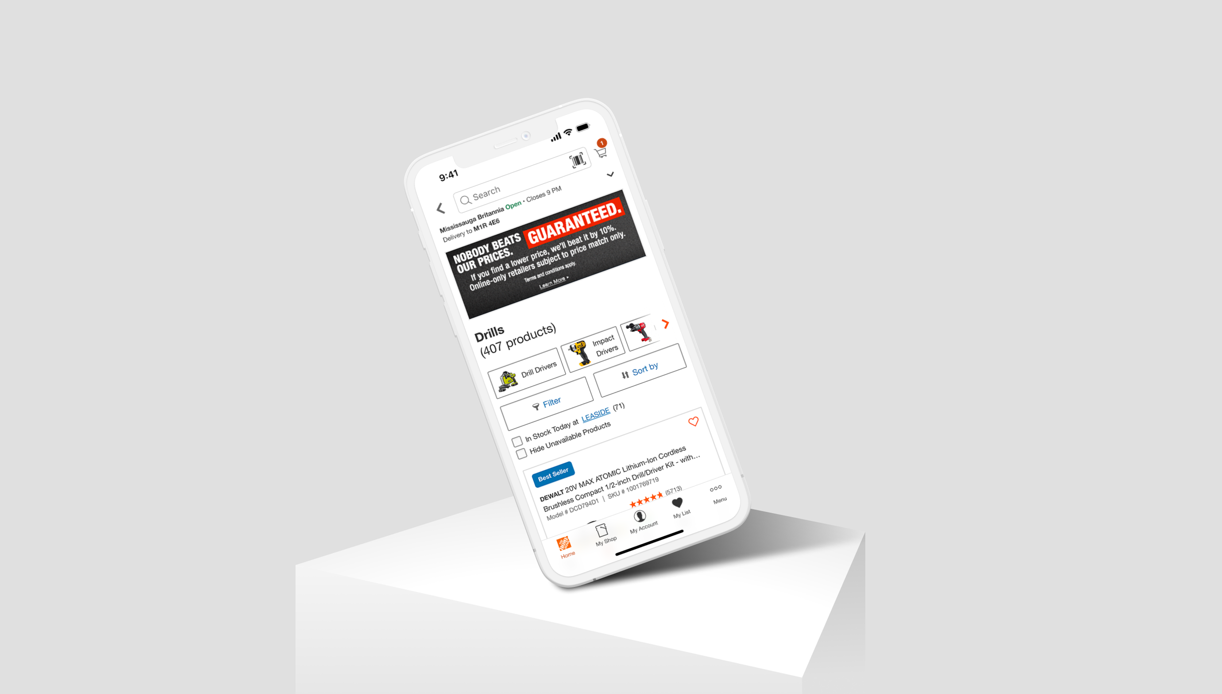
For the modern shopper, 'How much does it cost?' has been replaced by an equally critical question: 'How fast can it get to my house?'
In enterprise retail, hiding shipping dates until the final checkout screen is a conversion killer. The moment a customer feels uncertain about delivery timing, they open a new tab and buy from a competitor who gives them answers upfront. To bridge this gap, we turned our mobile app header into a powerful localization tool. By allowing users to change their postal code instantly at the top of the screen, we unlocked real-time delivery dates early in the shopping journey, transforming logistics into a seamless feature that drives conversion.
Project Role & Overview
Role: UX/UI Designer
Timeline: 4 weeks
Cross-functional partners: Product, iOS/Android engineering, DevOps
Business Goal: Drive conversion through fulfillment transparency
Research & Audit Insights
Ecosystem Audit
In the current mobile experience, customers lacked visibility into estimated delivery dates on Product Listing Pages (PLPs) and Search Results Pages (SRPs). To find fulfillment timelines, users were forced to click into individual Product Information Pages (PIPs) and manually enter their postal code through a multi-step flow. This structural friction disrupted the shopping momentum and lowered purchase confidence.
Our goal was clear: surface real-time delivery dates directly on the PLP/SRP. To achieve this globally, we needed to embed a postal code localization utility directly into the main application header.
However, during initial discovery, we uncovered a systemic challenge: the app was utilizing at least four distinct subheader variations across different pages. The main global header and the store locator utility were only accessible from the homepage. This required us to expand our scope from a simple feature addition to a comprehensive header consolidation initiative.
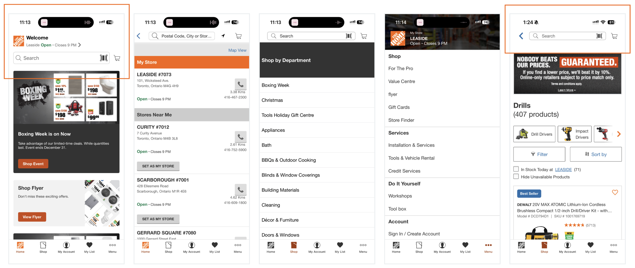
Header Exploration in Legacy APP Experience
Competitive Analysis
To understand industry design patterns for mobile localization and context-aware headers, we audited major retail competitors. We focused heavily on how they balanced global consistency with real-time fulfillment utilities.
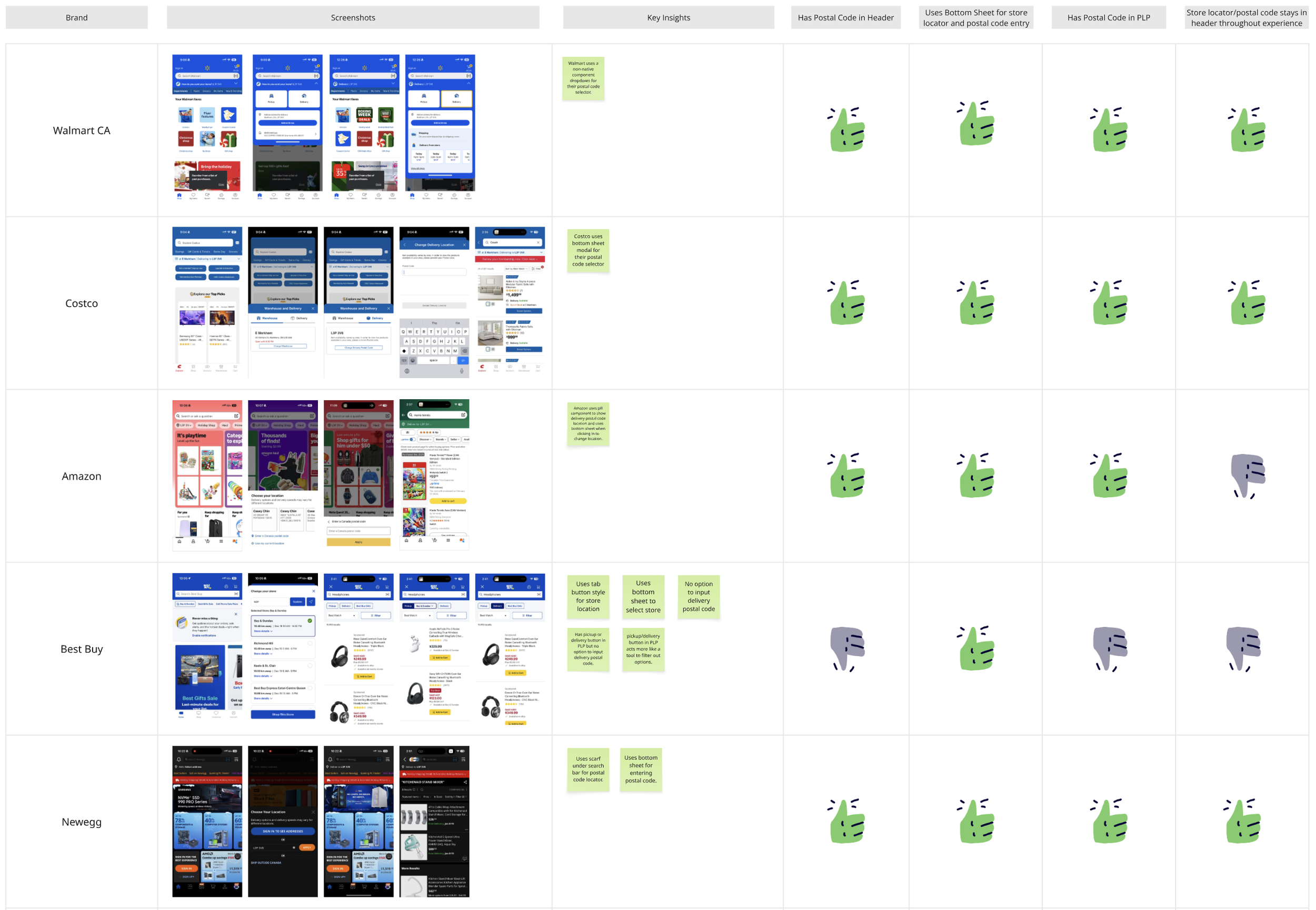
Competitor Analysis
Key Insights and Opportunities
Interaction Design: 100% of analyzed competitors utilized a native bottom sheet as the interaction pattern for postal code entry. Our assumption was confirmed this pattern as the mental mode with the lowest friction for mobile shoppers.
Unified Header: Unlike our current experience, top-tier retailers maintained a single, consistent global header throughout the entire shopping journey rather than changing layout patterns page-by-page.
Dual Entry Access: Leading platforms allowed users to input or update their location from both the global header and directly on the PLP/PIP, maximizing convenience.
Deep Dive: Deciding on the Bottom Sheet
I chose a modal bottom sheet for the postal code entry because it’s a pattern that just works beautifully on mobile. Unlike pushing a user to a whole new screen or using a jarring pop-up alert, a bottom sheet keeps people right in their current context. It feels incredibly natural for one-handed thumb interactions, and it gives us a flexible shell we can reuse for other localized features down the road.
To make sure this experience felt seamless and completely baked into the phone's native feel, I took a close look at how iOS and Android handle this component. My focus was on three main things:
Platform Guidelines: I dove into Apple’s Human Interface Guidelines (HIG) and Material Design 3 to map out the exact platform behaviors; things like how the background dims, how fast the sheet slides up, and how users can swipe down to dismiss it.
UX Validation with Gemini: I used Gemini as a research partner to quickly look up and cross-reference mobile best practices from the Nielsen Norman Group (NN/g) and Baymard Institute. Instead of spending hours digging through articles, this helped me instantly check my assumptions around how mobile bottom sheets should behave, how to handle input fields, and what the best user experience would be before I started designing.
Designing for the Keyboard State: I designed the sheet to open at a partial height (half-screen) so users could still see the product page in the background. I also mapped out exactly how the text field shifts up when the phone's keyboard pops up, making sure the "Submit" button never gets covered up or blocked.
Checking in with Engineering Early: I teamed up with our iOS and Android developers right away to understand their technical limitations. Chatting with them early helped me figure out where we could use standard native components to save development time, and where we needed to customize things to keep our brand looking sharp.
The Architecture Debate: Native vs. Webview
One of the biggest hurdles during this project was a major debate over when to use native components versus webview. In our app, key pages like the PLP, PIP, and checkout flows are all run on webview. Because of that, the initial project scope was to just keep things split: use native elements where the app was already native, and webview where it was webview.
But as I started designing, I realized this would create a really jarring, fragmented experience for our users. I built a mapping chart to visualize exactly where native and webview intersected. Looking at it, I knew that to make changing a postal code feel smooth and intuitive, we needed a consistent, native global header and bottom sheet, even on the webview pages.
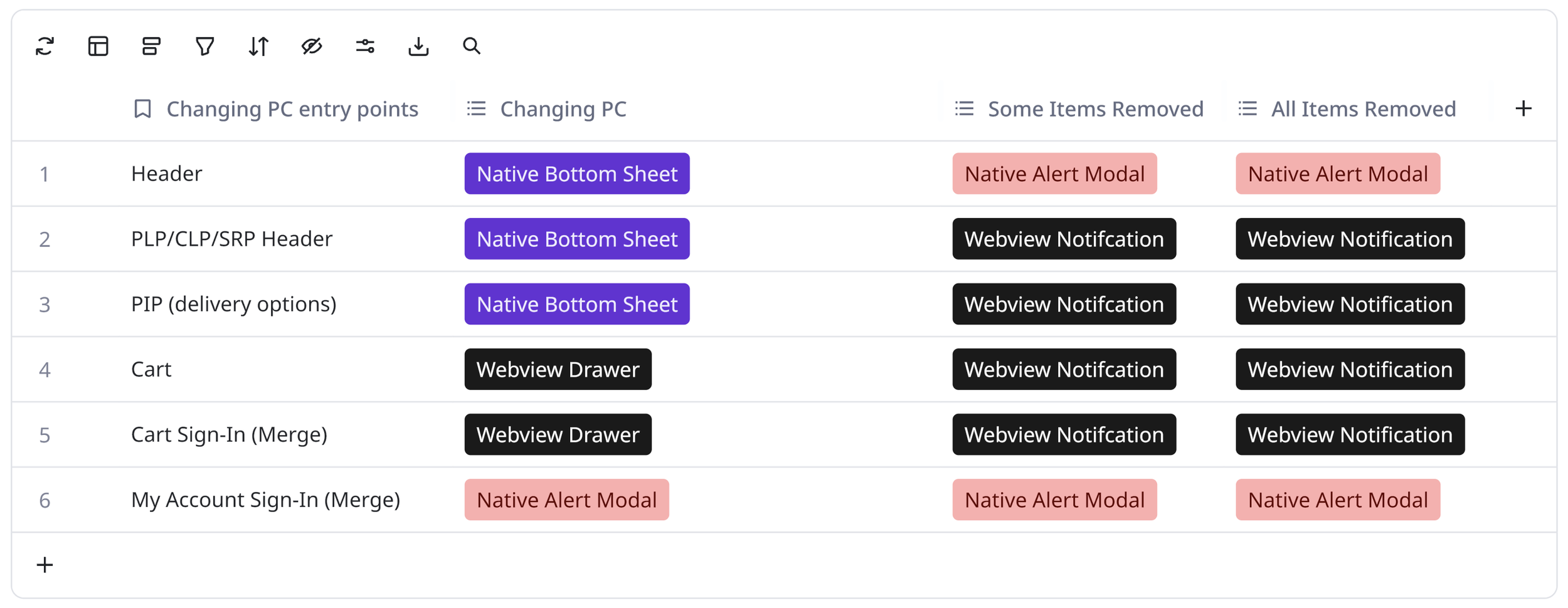
Understanding Native vs. Webview Experience
This led to a lot of back-and-forth. Our engineering team, and even my design lead, initially pushed to keep it strictly webview because it was much faster, simpler to build, and wouldn't rock the boat. I stood my ground, advocating for the native experience as long as it didn’t cause a performance hit.
I focused my argument on the bigger picture: the need for a unified global header across the entire app. Once I showed everyone how a consistent header architecture would benefit the overall app experience, engineering did a pivot. They agreed that if we were going to standardize the global header anyway, building the native interaction was absolutely the right move. They figured out a way under the hood to suppress the standard webview constraints on those pages so our new native header and bottom sheet could take over seamlessly.
The Solution: Simplifying the Global Header
When I first started iterating on the new header layout, I hit a major wall. Trying to cram the new postal code feature into our existing header just wasn’t working. It looked incredibly cluttered, and the elements felt like they were fighting each other for space.
Instead of trying to force it, I decided to take a step back and look at what we could remove—and what we could combine. I wanted to eliminate the visual noise that wasn’t bringing real value to the customer so they could focus on what actually mattered. After doing a deep dive into how modern retail apps handle their navigation and using Gemini to pull together industry benchmarking, I proposed a few major, radical shifts:
Removing the Corporate Logo: Since Home Depot is a globally recognized brand and users explicitly tap our app icon to open it, keeping a massive logo in the header felt redundant.
Dropping the "Welcome" Message: The legacy greeting took up incredibly high-value real estate but didn't actually help the user shop. Plus, a personalized greeting already lives right at the top of the "My Account" tab, where it belongs.
Combining Store & Postal Code into One Location Trigger: Previously, the store locator and the postal code entry were completely separate pieces. This was really confusing for users who just wanted to know, "Can I get this item?" I combined them into a single location utility in the header. Now, clicking it opens up our native bottom sheet, where users can clearly see both options and decide whether they want to update their home delivery postal code or switch their local pickup store. It streamlined the header and cleared up all that functional confusion.
The kicker was that because our legacy experience changed headers page-by-page, the logo and welcome elements were only present on the homepage anyway. They weren't interactive, they didn't do anything, and the second a user navigated away from the homepage, they disappeared. They were just eating up space on day one.
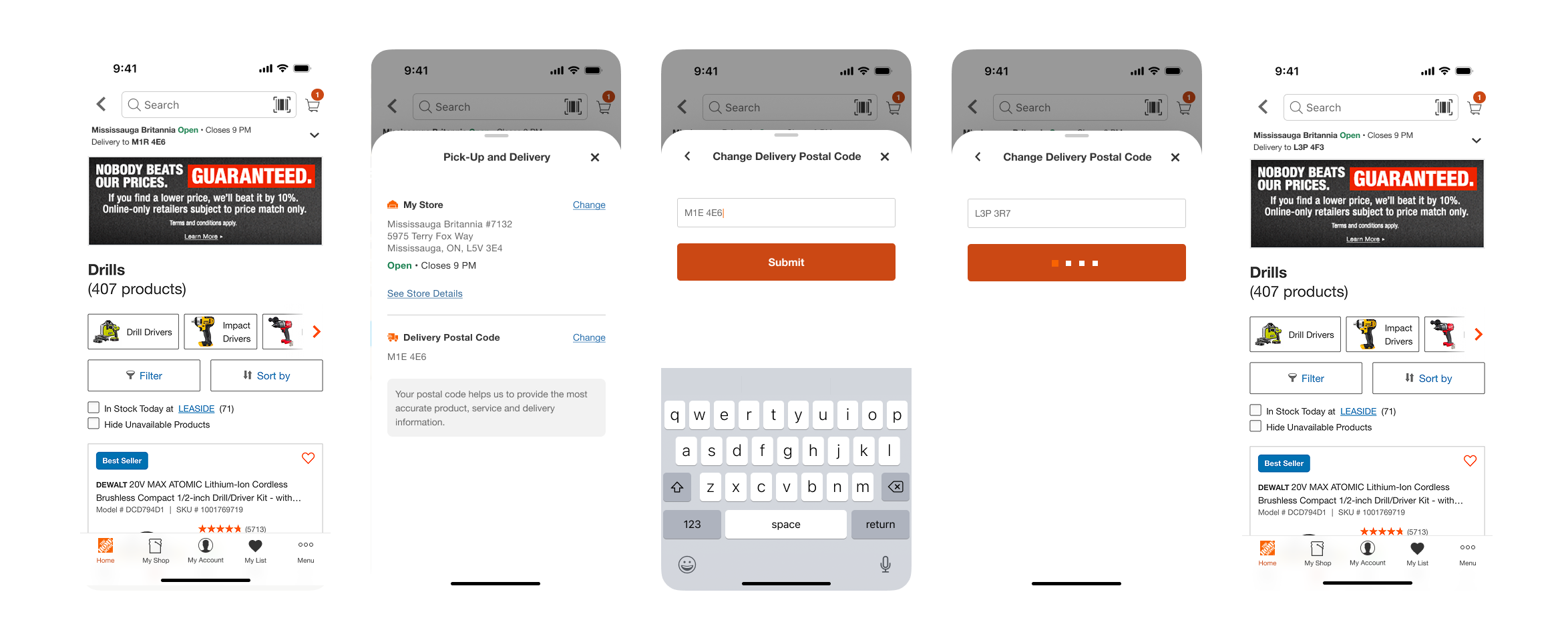
Final Design of updating your postal code flow.
While these might seem like simple UI cleanups, making changes to global branding elements in an enterprise app is a massive deal. It required pitching this minimalist direction to a huge group of cross-functional stakeholders to get their buy-in. To my surprise, a lot of them had been feeling the same way about the clutter but just hadn't seen a path forward. They completely rallied behind the cleaner, task-focused design, which gave us the green light to move forward.
Catching a Late Opportunity with Engineering
Right after I delivered the final handoff and IT was already actively working on the requirements, we hit a really interesting turning point. Because we had combined the store locator and the postal code into that new bottom sheet, the interaction logic meant we were now touching the "Store Details" experience.
Initially, the interaction was a little clunky. In my handoff designs, tapping "Change Store" or "Store Details" inside our new bottom sheet would force a whole new page to slide in over the window, instead of keeping the user in that clean, bottom-sheet environment. My team and I originally assumed that moving the entire store-switching flow into the sheet would be way out of scope and too heavy a lift for this sprint, so we had designed around it.
But while the developers were digging into the code, they realized something great. They reached out and let me know that moving the store-switching flow into the sheet actually wasn’t going to be a heavy lift for them under the hood, and they could squeeze it into the current build.
I jumped on the opportunity immediately. While they were actively developing, I quickly spun up new iterations and pivoted the store-selection UI so that the entire experience cascaded seamlessly right inside the bottom sheet. It was a super fast turnaround on my end, but it made a massive impact; it eliminated that jarring layout shift and gave our users a beautifully smooth, unified interaction right at launch.
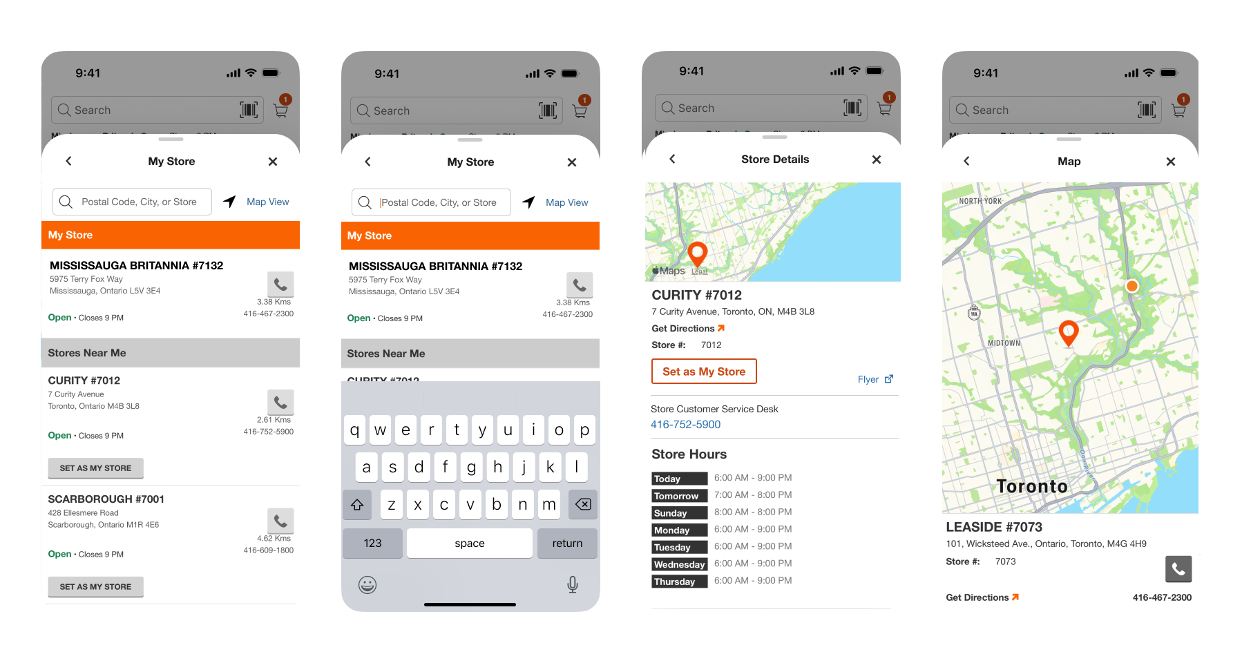
Final design of transitioning the store details piece to bottom sheet.
Strategic Impact & Reflections
We actually just recently launched this new unified header experience! Because it's fresh in production, we don’t have long-term data back yet. However, our immediate success metric was a systemic one: we successfully consolidated four fragmented header layouts into a single, high-utility native component that now gives our customers full delivery transparency across the entire app.
Moving forward, the product team will track feature adoption rates, specifically examining engagement with the new postal code entry in the header and analyzing checkout drop-off for localized sessions to measure the long-term lift.
Beyond the metrics, this project was a massive win for the user experience. By pushing the boundaries and simplifying the UI, we took a cluttered, page-by-page header experience and turned it into a single, clean, task-focused component. Plus, we baked in AA AODA accessibility compliance right from the start, so it works beautifully for everyone.
What We Learned - Retro
Once the code was shipped, I wanted to make sure we didn’t just move on to the next thing without looking back. I stepped up to lead a team retro so we could openly talk about what went well and what we need to fix.
The good news was that our early prep paid off, setting up our sprint dependencies early and doing regular UI demos with IT kept us from making major mistakes during development. And as a team, our adaptability was incredible when we had to pivot on the fly.
But the retro also exposed some real gaps in how we work. Design and IT still operate in silos too often, and communication can break down. To actually fix this instead of just talking about it, I’m taking ownership of two big next steps:
Figma Training for IT: Putting together a training session for our developers to show them how to navigate our design files, which is going to make our handoff process ten times smoother.
Fixing the App Design System: We realized our current component libraries are too fragmented, so we’re starting to map out a dedicated design system for the app to stop visual inconsistencies before they happen.
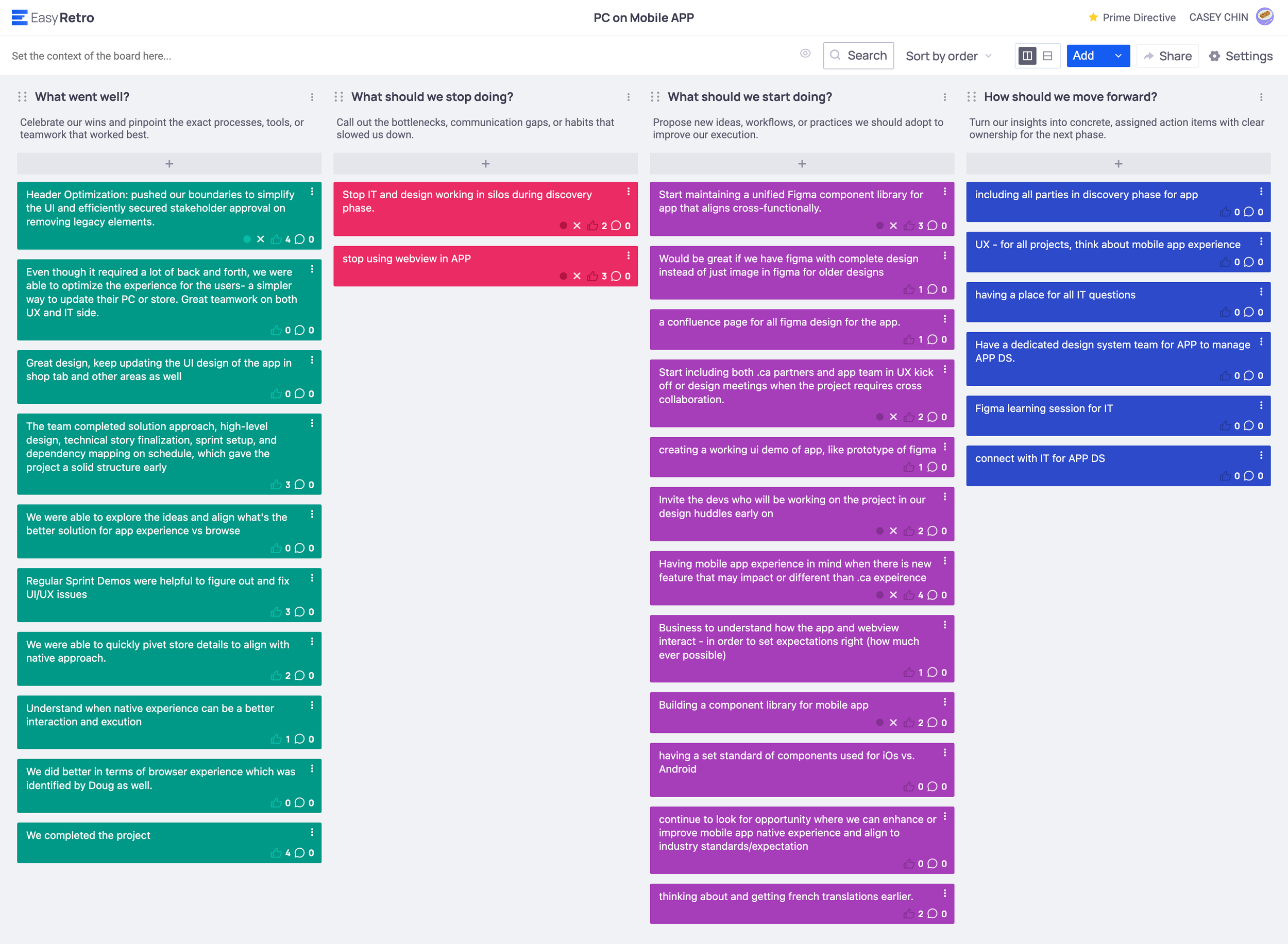
Retro board
Final Thoughts
If I had to sum up this project, it proved to me that as designers, we shouldn't just accept legacy constraints. Taking the risk to pitch a minimalist header to senior executives and winning their buy-in showed me the value of standing up for a better user experience. Moving forward, now that we have this clean, modern header shell, I’m really excited to explore how we can use AI to personalize it even further for our customers.