Redesign: Limelight Platform
Preliminary Research
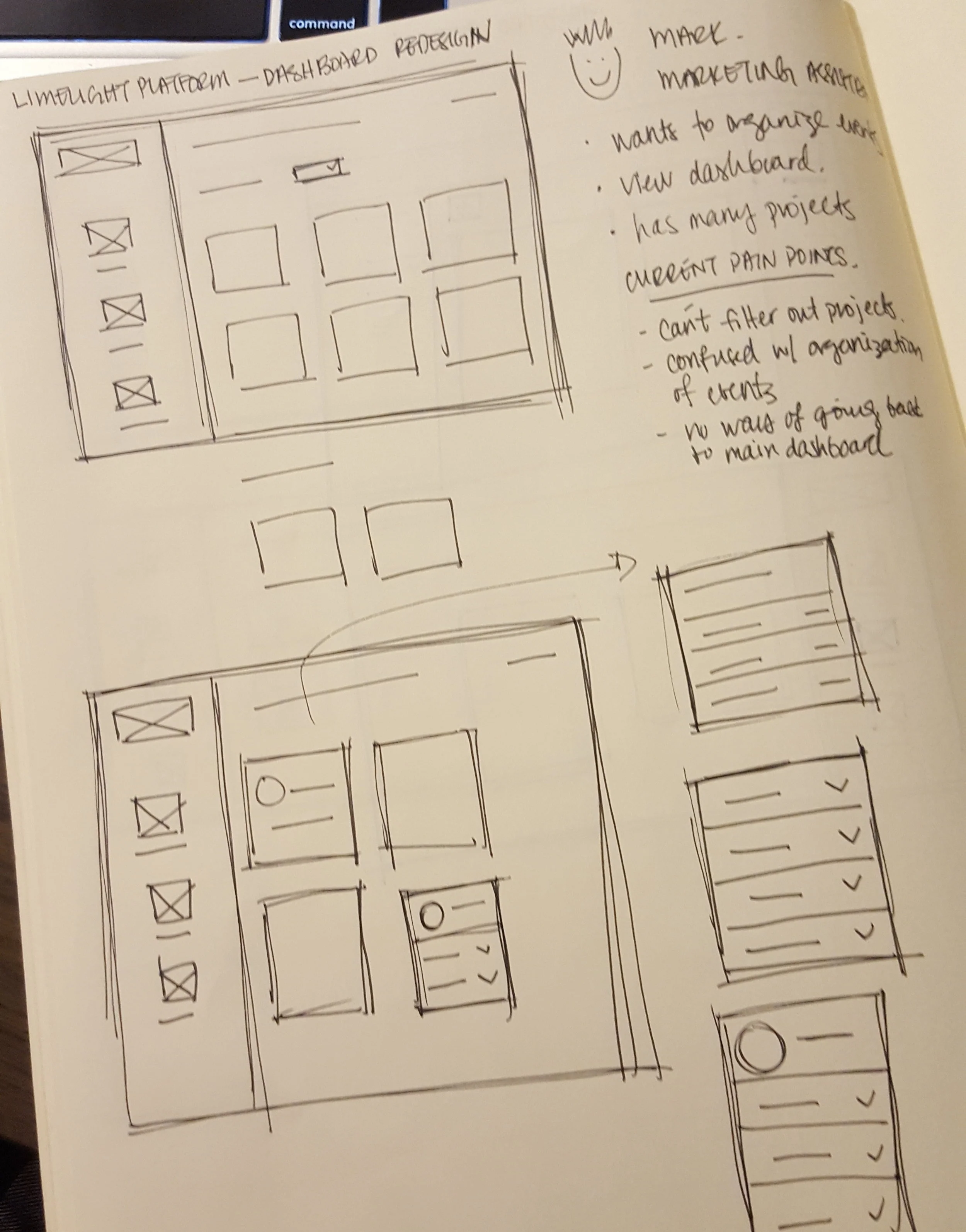
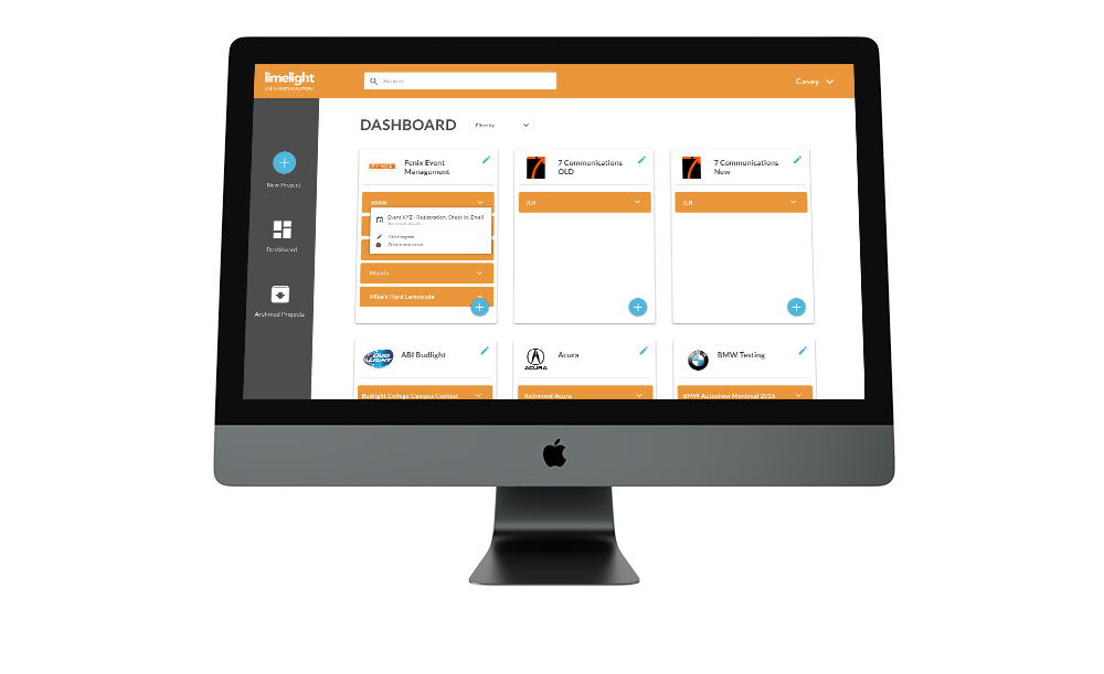
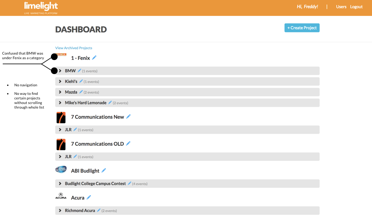
By having access to the current platform, I logged in and began by playing around with the current dashboard. My findings showed that there were several pain points that I wanted to address, and picked the top 3.
Pain Points
Poor Navigation
a. Back button at the top right corner is not noticeable to users.
b. To navigate from one of the events analytics to database, I would have to go back to the main dashboard instead of being able to directly click through in the same project.No way to filter out brands when there are multiples
The organizational structure of the events are confusing to a first time user. It is not clear that each program was under a main brand as the titles were all brand names.
redesign
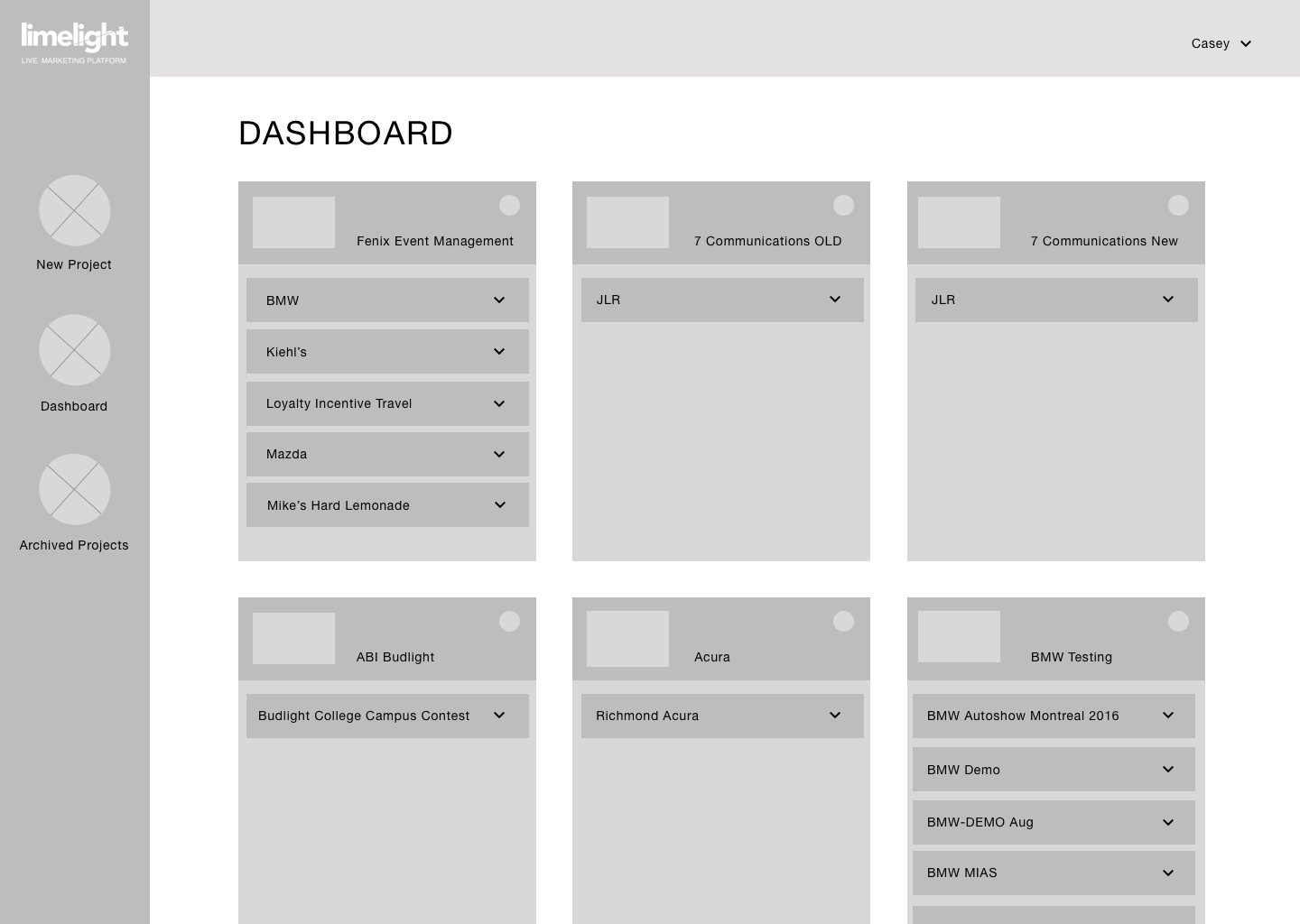
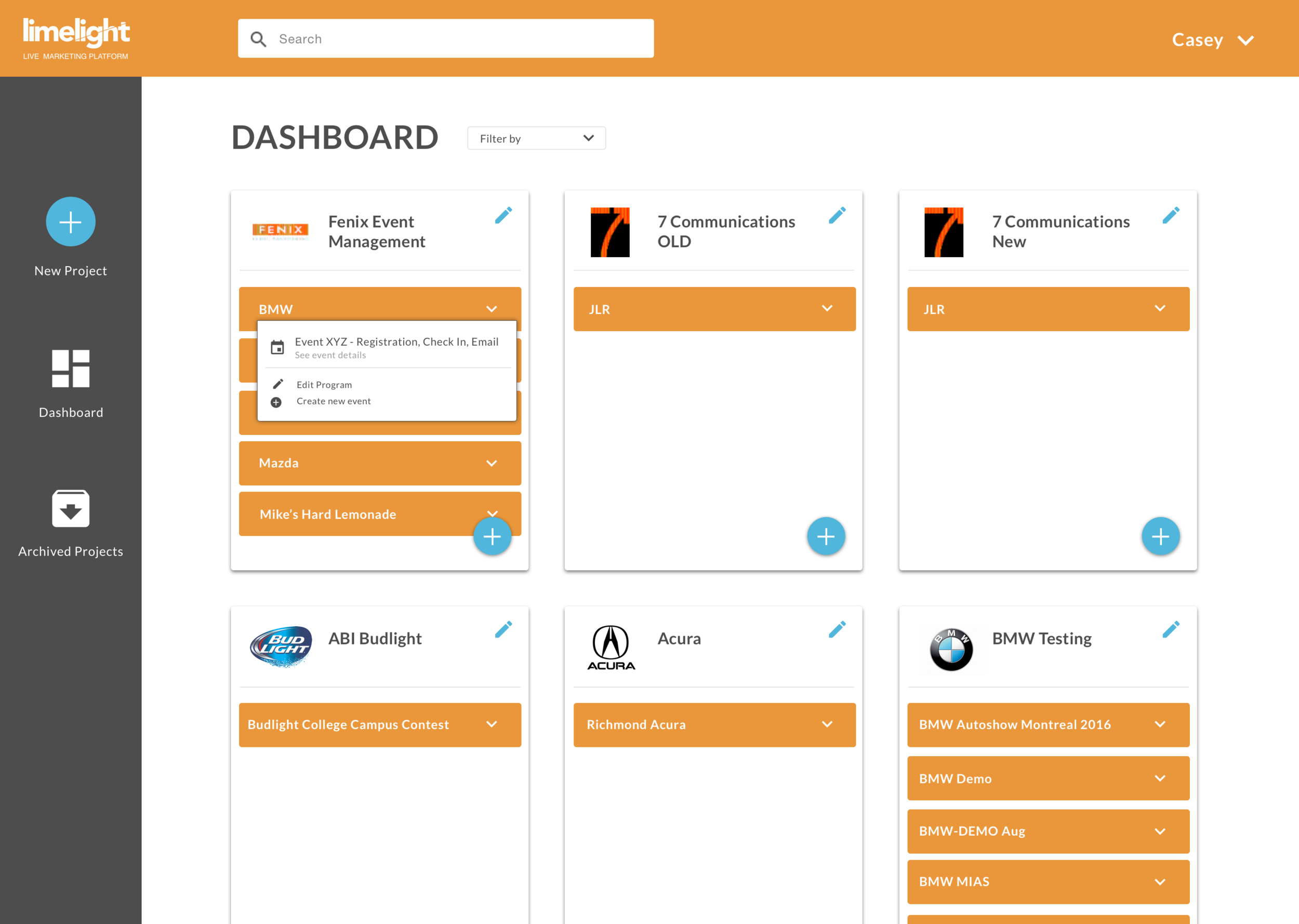
The focus for this redesign was to create a better organization of information. I wanted to keep the platform clean and really speak to the current branding by trying to keep with the current brands colour usage and visual language.
Redesign Opportunities
- Organizing the brands and their subcategories into a more user friendly approach
- Having an easy way to create new projects within each brand
- Creating a navigation bar for new projects, archived projects, and dashboard
- Being able to filter and search for projects
- A simplified way to view and edit upcoming events in subcategories